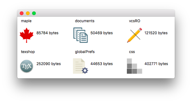
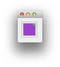
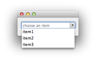
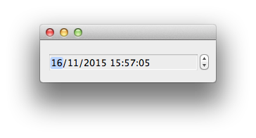
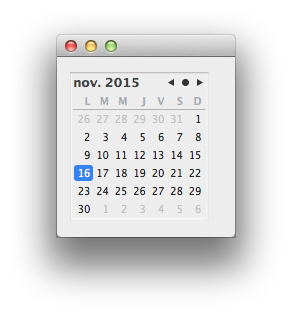
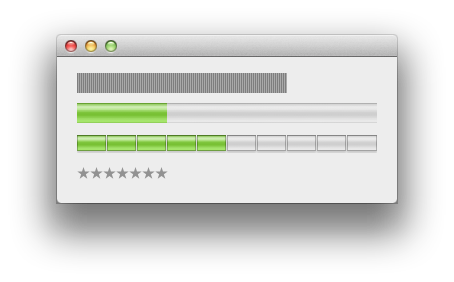
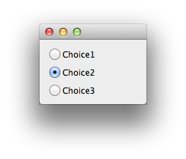
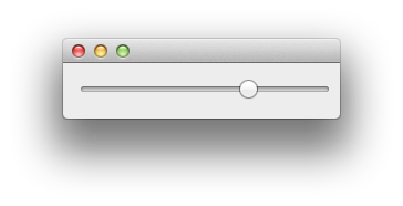
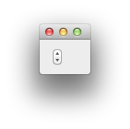
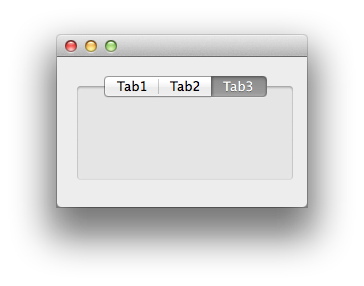
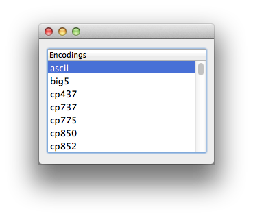
The [view] command.
Introduction
The [view] command lets you create and manipulate
different kinds of root windows, dialogs, sheet dialogs, palettes and the
subviews or widgets (buttons, indicators, lists, menus, etc.) they contain.
The [view] command is based on NSView, an object-oriented
view system available for implementing Cocoa user interface elements. All
of the standard controls can be considered views. The conceptual
presentation of the NSView system can be found on the Apple's
Developer Connection in the
NSView Programming Guide.
The NSView Programming Guide explains the concepts behind
the NSView model, covering the view embedding hierarchy
(child-parent relationship) and composited drawing.
The model proposed in Alpha with the [view] command
parallels this view system. This approach is quite different from the one
adopted by the now obsoleted [dialog] command which was in use in
Alpha and older versions of the Alpha text editor. The main features are:
- each element of a dialog or window is created individually and can be
manipulated independently from the others;
- the properties of a subview can be modified programmatically;
- all the subviews can execute Tcl scripts or Tcl procs. They all
support a -command option which lets you specify a piece of Tcl
code which is executed when the view is clicked or when an editable field
is validated.
- this model is not limited to dialog windows: the [view]
command can create and manage various kinds of root windows
(Dialog, Document, Drawer, Float, Sheet, Status).
Note that popover windows are also implemented by Alpha but you
must use the [popover] command instead of the [view]
command.
Parents and children
The [view] command makes a distinction between two kinds of objects:
- root objects which are created with the [view root] command;
- view objects, also called subviews, which are created with the
[view create] command.
The root objects are basically windows and dialogs. The subviews can
contain other subviews and can be embedded in a root view. When a view A is
embedded inside a view B, B is said to be the parent (or superview) of A and A is a child of B. The root objects are the
top of the hierarchy: subviews can exist independently from any root view
but will be displayed only when they are inserted in a root view. It is
always possible to add or remove subviews from a parent or a root view, or
to modify the child-parent relationship.
Coordinate system
The [view] command simplifies the process of placing items within a
view by using a coordinate system that is always view-relative: the
placement of objects within a view is done relative to that view, that is
to say, the origin is in the lower left corner of the view. The coordinates
of items in the view won't change even if the view itself is moved. This
relative coordinate system makes it much easier to calculate the position
of views and the objects within them.
Root views of course do not use relative coordinates since they are
at the top of the hierarchy and have no parent or superview: the positions
for root views are given in absolute screen coordinates.
In both cases (views and roots), the origin of the coordinate system
is the lower left corner: the y-axis is oriented upwards, the x-axis is
oriented to the right.
Several [view] subcommands support a -frame option
which applies both to root views and subviews. As explained above, in the
case of a root view, the value of the -frame option is in global
(screen) coordinates; in the case of a subview, it is in frame coordinates,
i-e coordinates relative to the view's superview.
The value of the -frame option is always a four-element list
corresponding to the x-coord and the y-coord of the origin, and the width
and height of the view. For instance, the following instruction:
view configure $v -frame [list 10 20 300 130]
positions the view $v inside its parent at the point of coordinates
(10, 20). This point is the lower left corner of a rectangle of width 300
and height 130. The values are given in pixels.
All rectangles in Alpha are specified as quadruplets of this
same type {x,y,w,h}.
Supported root windows
Different kinds of root windows can be defined with the [view]
command. The following table indicates in the left column the name to use
in the [view root] command in order to create
the corresponding window.
Currently, the following 6
kinds of root windows are supported by the [view] command:
| Name | Description |
| Dialog | Movable modal window |
| Document | Document window |
| Drawer | Drawer window attached to another window |
| Float | Floating window |
| Sheet | Modal window sliding out of another window |
| Status | Status window |
A complete description of the root windows is given in the
Roots description section.
Supported views
Different kinds of views can be defined with the [view] command.
The following table indicates in the left column the name to use in the
[view create] command in order to create the
corresponding view.
Currently, the following 34
kinds of views are supported by the [view] command:
| Name | Description | Cocoa class | Inheritance |
| Box | Box | NSBox | NSView |
| Browser | Browser | NSBrowser | NSControl : NSView |
| Button | Button | NSButton | NSControl : NSView |
| CollectionView | Collection view | NSCollectionView | NSView |
| ColorWell | Color well | NSColorWell | NSControl : NSView |
| ComboBox | Combo box | NSComboBox | NSTextField : NSControl : NSView |
| Control | Control | NSControl | NSView |
| DatePicker | Date picker | NSDatePicker | NSControl : NSView |
| ImageView | Image view | NSImageView | NSControl : NSView |
| LevelIndicator | Level indicator | NSLevelIndicator | NSControl : NSView |
| Matrix | Matrix | NSMatrix | NSControl : NSView |
| MovieView | Movie view | NSMovieView | NSView |
| OutlineView | Outline view | NSOutlineView | NSTableView : NSControl : NSView |
| PDFView | PDF view | PDFView | NSView |
| PathControl | Path control | NSPathControl | NSControl : NSView |
| PopUpButton | Popup button | NSPopUpButton | NSButton : NSControl : NSView |
| PredicateEditor | Predicate editor | NSPredicateEditor | NSRuleEditor : NSControl : NSView |
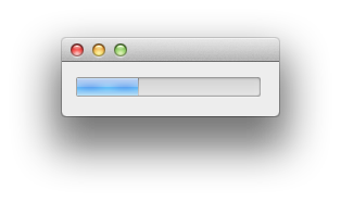
| ProgressIndicator | Progress indicator | NSProgressIndicator | NSView |
| ScrollView | Scroll view | NSScrollView | NSView |
| Scroller | Scroller | NSScroller | NSControl : NSView |
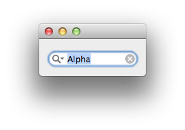
| SearchField | Search field | NSSearchField | NSTextField : NSControl : NSView |
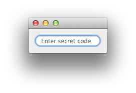
| SecureTextField | Secure text field | NSSecureTextField | NSTextField : NSControl : NSView |
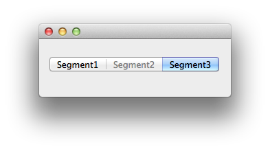
| SegmentedControl | Segmented control | NSSegmentedControl | NSControl : NSView |
| Slider | Slider | NSSlider | NSControl : NSView |
| SplitView | Split view | NSSplitView | NSView |
| Stepper | Stepper | NSStepper | NSControl : NSView |
| TabView | Tab view | NSTabView | NSView |
| TableView | Table view | NSTableView | NSControl : NSView |
| TextField | Text field | NSTextField | NSControl : NSView |
| TextView | Text view | NSTextView | NSText : NSView |
| ThumbnailView | Thumbnail view | PDFThumbnailView | NSView |
| TokenField | Token field | NSTokenField | NSTextField : NSControl : NSView |
| View | View | NSView | NSResponder |
| WebView | Web view | WebView | NSView |
A complete description of the views is given in the
Views description section.
Synopsis
The [view] command has the following formal syntax:
| view subcommand ?options? |
The subcommand argument specifies the action to perform:
creating a view, embedding a view in a parent view, removing a view from
its parent, getting or setting properties of the view, etc.
Quick start example
Here is a simple example to give a first feeling of how things work:
# Create a root window
set root [view root Document -frame {250 250 360 380}]
view configure $root -title "View Sample"

# Create some subviews
# A scroll view
set scrTkn [view create ScrollView -frame {13 187 334 180} -parent $root]

# An image view
set imgFile [file join $APPLICATION Contents Resources about.png]
set img [imageRef create -file $imgFile]
set imgTkn [view create ImageView -frame {0 0 450 259}]
view configure $imgTkn -image $img

# Let the scroll view control the image
view configure $scrTkn -view $imgTkn

# A combo box
set cbTkn [view create ComboBox -frame {90 154 180 25} -parent $root]
view configure $cbTkn -items [list item1 item2 item3]

# A text edit field
set sttxt [view create TextField -frame {90 121 180 25} -parent $root]
view configure $sttxt -placeholder "Enter something"

# A date picker
set clock [view create DatePicker -frame {90 88 180 25} -parent $root]
view configure $clock -dateValue [clock seconds]

# A checkbox
set chTkn [view create Button -frame {13 55 180 25} -parent $root]
view configure $chTkn -type 3 -title "I like!" -value 1

# A button
set butTkn [view create Button -frame {259 13 88 25} -parent $root]
view configure $butTkn -title "Click here" -style 1 -command hi::close

# Display the window
view show $root
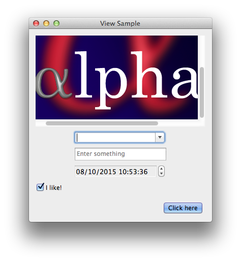
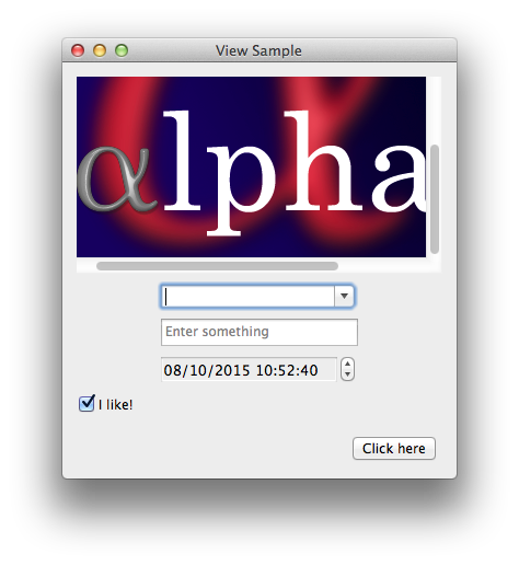
Here is the window created by this code:

This example makes use of hard-coded frame coordinates for each
subview. This is not the best way of constructing an interface and it is in
fact not necessary: there is a set of useful Tcl procs which lets you
manipulate dynamically the frames so that no computation is required. These
procs are available in the viewRects package in AlphaTcl. See the
ViewRects package section at the end of this
document for more information and a complete rewriting of the previous
example based on the viewRects procs.
Syntax of the [view] subcommands
In all the syntax descriptions below, the token or parent
arguments designate the unique token obtained when an item is initially
created (either with the [view create] or the [view root]
commands).
The [add] subcommand
- view add parent token ?token...?
This command inserts one or several subviews in a parent. The parent
can be either a view, or a root and is designated by the parent
argument (whose value is the token of the view or root). This can be
undone later using the [view remove] command.
The [cell] subcommand
- view cell token ?index? option ?value? ?option value...?
This command allows you to directly configure the cells associated with
certain controls. It is useful mainly for views with multiple cells (like
Matrix or FormView) in order to
address the individual cells and get or set their properties.
The index argument is optional. It specifies which cell of
the control is targetted by this command. In the most general case, the
value for the index argument is a list of two integers indicating
the row and the column occupied by the cell. If the view has only one row
or one column, it is possible to specify a single value which is the index
of the cell in the row or column respectively. All these indices are
0-based: if the value is {2 1}, the corresponding cell is the one
on the third row of the second column. The default value
for the index argument is 0, which is convenient for controls with
a unique cell (in which case the index argument may be omitted).
The available options are described in the
Cell Options section.
The [children] subcommand
- view children ?-recurse? token
This command lists the tokens of the children views created with the [view create] command. The token argument can be
the token of a root window or the token of a parent view.
By default, only top-level subviews are listed. You can specify the
-recurse option to descend in the views hierarchy.
The [configure] subcommand
- view configure token option ?value? ?option value...?
Possible options and values are described in the View Options
section below.
This command can be used to obtain the value of an option, with
the following syntax:
view configure token option
In order to set the value of an option, the syntax is:
view configure token option value
Several options can be set simultaneously like this:
view configure token option1 value1 option2 value2...
The [create] subcommand
- view create kind ?-parent token? ?-frame {x y w h}?
The kind argument specifies the kind of control you want to create. The
possible values are indicated in the first column of the
Supported Views table above. In order to create
a root window or dialog, one must use the [view root]
command instead.
The [view create] command returns a token which uniquely identifies the
new object and can be used in other commands.
The -parent argument lets you optionnally set the parent
for the newly created view. The parent can also be set later using the
[view add] command.
The -frame argument lets you optionnally set the
rectangle frame of the view. Rectangles are specified by a quadruplet of
the form {x y w h}, where x and y are the coordinates of the lower
left corner, and w and h are respectively the width and the height of the
rectangle. See the Coordinate system section.
By default, a view object created with the [view create]
command is initially visible. Visibility of views can be controlled with
the -visible option specified with the [view configure]
command.
The [delete] subcommand
- view delete ?-norecurse? token
This command can be used to dispose of a root window created with the
[view root] command or of a view created with the
[view create] command. This releases the corresponding
object in memory and invalidates the token. In case of doubt, one can test
if a token is still valid using the [view valid]
command.
By default, all the subviews contained in the root window or in the
view designated by the token argument will also be disposed of
recursively. You can specify the -norecurse option to
limit deletion to the object identified by token: in that case,
any subview created by the [view create] command will
be left intact and its token (the subview's token) will remain valid.
The [focus] subcommand
This command can take three forms
- view focus set root token
- view focus get root
- view focus clear root
The first form lets you specify a view to set the focus on, inside
some root window. The value of the root argument is the token of
some root window and the value of the token argument is the token
of the view which will be focused.
The second form returns the token of the currently focused view
inside the root window designated by the root argument. The value
of this argument should be a valid root window token.
The third form clears focus from the currently focused control in the
root window designated by the root argument. The window will be left
such that no control is focused within it.
The [hide] subcommand
This command lets you hide a root window or a subview. It just makes it
invisible. The opposite action is achieved with the [view show] command.
In the case of a sheet or a drawer window, this command has the
effect of sliding the window back inside the edge of the parent window it
is attached to.
In the case of a dialog window, it interrupts the modal loop and
dismisses the dialog.
This command can be interpreted as a "close" command and is
equivalent to what happens when the user clicks on the Close button of the
root window (if it has one). By default, the root window is still available
after the execution of this command unless the -oneShot option was specified with a value 1 when the window was created
with the [view root] command.
The [kind] subcommand
This command is useful only for identification purpose. It returns the kind
of the object represented by the token argument. It is the value
which was specified as the kind argument in the [view root]
or [view create] commands.
See also the [view type] command to determine
the type of the token (root or view).
The [list] subcommand
- view list ?-type (roots|views)? ?-kind str?
This command returns a list of the currently defined objects. It supports
the following options in order to filter the result:
- the -type option lets you restrict the
list to either root windows (created with the [view root] command) or views (created with the [view create]
command). Its value is roots or views and can be
abbreviated. If it is not specified, both types are listed.
- the -kind option lets you restrict the
list to a particular kind of roots or views. If it is not specified, all
existing kinds are listed.
The possible values are indicated in the first column of the
Supported Views
or
Supported Root Windows
tables above.
In order to get only a list of the subviews included in a particular
object, use the [view children] command instead.
The [move] subcommand
This command moves a view by a certain distance, relative to its current
location. This affects the location of a view's frame, but not its
dimensions. The arguments are:
- dx
- the horizontal distance to move the view by. Negative values move the view to the left, positive values to the right.
- dy
- the vertical distance to move the view by. Negative values move the
view upwards, positive values downwards.
This command can be applied to root windows created with [view root] or
to simple views created with [view create]. When a view is moved, all
the subviews it contains are also moved.
The [ordered] subcommand
- view ordered ?-kind str? ?token?
This command manages the order of root windows.
If no token
argument is specified, the command returns a list of tokens corresponding
to the root windows in their front-to-back ordering on the screen. The -kind option lets you restrict the list to a
particular kind of root window. If it is not specified, all existing
kinds are listed. Useful kinds are Document or Float.
If a token argument is specified, the command brings the
corresponding root window to the front.
The [parent] subcommand
- view parent ?(-root|-view)? token
This command finds the parent of the view specified by token. The
token argument must be a view's token: passing a root's token
raises an error.
If this command is invoked with the -view option, it returns the
token of the parent view of the view specified by the token
argument, or it raises an error if the view currently has no parent. The
parent view, if it exists, could be another view or a root window.
If this command is invoked with the -root option, it returns the
token of the top root window containing the view specified by the token
argument, or it raises an error if the view is not currently installed
in a root window.
If no option is specified, the -view option is assumed by
default.
The [refresh] subcommand
This command forces the view (or root window) specified by the token argument to redraw itself together with all its subviews. In the case
of a WebView, it means reloading the current page. In the case
of a CollectionView, it means reloading all the data for the items.
The [remove] subcommand
- view remove parent token ?token...?
This command is the opposite of the [view add] command. It removes one
or several views from their superview.
The [root] subcommand
- view root kind ?option value? ?option value...?
This command is used to create a root window.
The kind argument can have one of the following values:
Dialog, Document, Drawer, Float, Sheet, Status. See the
Supported Root Windows table
for a short description.
The Roots description section below provides
detailed information about the characteristics of the different kinds of root
views and the specific options they support.
The [view root]
command returns a token which uniquely identifies the
new object and can be used in other commands.
It is important to note that a root window created with
[view root] is initially invisible. You must explicitely invoke the
[view show] command to display the window. Typically you would do
this after you have installed all the view controls in your window.
Visibility of root windows is controlled by the [view show]
and [view hide] commands.
The options which can be specified in the [view root]
command are described in the Root creation options section.
The options which can be specified later with the
[view configure]
command are described in the Root configuration options section.
The [search] subcommand
- view search ?-f (0|1)? ?-i (0|1)? ?-wrap? token string
This command is used to search the contents of a view. It applies only to
views of type TextView or WebView. The options have the same meaning as with the [search]
command:
| -f (0|1) | search backward or forward (default 1) |
| -i (0|1) | ignore case (default 0) |
| -wrap | wrap around |
If a match is found, it is hilighted. Otherwise the command raises an
error. Search starts at the current position, so that you can invoke the
command repeatedly to find the successive matches. More precisely, if
there is already a selection, the search starts after the selection (when
going forward) or before it when going backwards.
The [show] subcommand
- view show ?(-w win|-parent parentToken)? token
This command lets you show a root window or a subview. It just makes it
visible. By default, the root views (created with the [view root]
command) are initially invisible, whereas the subviews (created with the
[view create] command) are initially visible.
The -parent and -w options concern the root windows of type
Sheet or Drawer. They let you
specifiy a parent window for the sheet or the drawer:
- the -parent option lets you specify the token of a parent root view created with the [view root] command
- the -w option lets you specify a document window opened by Alpha.
If no option is specified, the sheet or drawer window is attached to the
current window (the topmost editing window).
When applied to a window of type Dialog, this
command runs the dialog: it blocks the execution of the Tcl script until
the dialog is dismissed.
The opposite action is achieved with the [view hide] command.
The [tag] subcommand
This command returns the token of the nearest descendant (including itself)
of the view specified by the token argument, which corresponds to
the specified tag value. One can set a tag on a view with the -tag
option of the [view configure] command. Note that only control
views (views inheriting from the NSControl class) support tags.
The [type] subcommand
This command returns the type of the object specified by the token
argument. The possible values are root (if the object was created
using the [view root] command) or view (if the
object was created using the [view create] command).
See also the [view kind] command to determine root's
or view's kind.
The [valid] subcommand
This command indicates if a root or view token is still valid. It
returns 1 if the token is valid, 0 otherwise.
Root options
The next subsections describe the options available for root windows
created with the [view root] command.
Root creation options
On creation of a root window, several options can be specified in
the [view root] command.
The drawer windows have their own set of options described below.
The following options are available for all the other kinds of root
windows:
- -border
- the -border option is a boolean value telling if the window must be
drawn with a border or not. The default value is 1. If it is set to 0, the
window displays none of the usual peripheral elements. This is useful only
for display or caching because, in that case, the window can't become key
window (i-e won't receive key events).
- -closeBox
- the -closeBox option specifies if the title bar of the root
window has an active closing button (red button in the upper left corner of
the title bar). This applies exclusively to root views of type document, float and utility. Possible values are 0 or 1. The
default is 1 (except for dialogs).
- -collapseBox
- the -collapseBox option specifies if the title bar of the root
window has an active collapse button (yellow button in the upper left
corner of the title bar). Possible values are 0 or 1. The default is 1
(except for dialogs).
- -frame
- the -frame option specifies the coordinates of the content area of
the window, in screen coordinates. The rectangle is specified as a
{x,y,w,h} quadruplet which represents the contents area, that is to say
that it does not include the height of the title bar. Note that in the case
of a root window of type Dialog, the x and y
coordinates do not matter because dialogs are automatically displayed
centered on the screen: more precisely, a dialog is placed by the system
exactly in the center horizontally and somewhat above center vertically
where the user can't miss it.
- -metal
- the -metal option is used to set the metalled texture. It applies
only to root views of type document and float (drawers also
inherit the metal appearance from their parent window). Possible values are
0 or 1. The default is 0.
- -oneShot
- the -oneShot option specifies whether the root window should be
deleted when it is closed. Possible values are 0 or 1. The default is 0,
which means that, by default, a root window is not disposed of when closed
and you are responsible for releasing it yourself with the [view delete] command when you don't need it anymore. On the contrary,
specify a value 1 if you want the root window to be released when closed:
in that case, all the subviews will also be deleted recursively (see the
discussion about recursive deletion in the [view delete] section). This option is ignored by the roots of kind Drawer.
- -resizable
- the -resizable option specifies if the root view should be
resizable. Possible values are 0 or 1. The default is 1 (except for
dialogs).
- -titlebar
- the -titlebar option specifies if the root view should display a
title bar. Possible values are 0 or 1. The default is 1.
- -zoomBox
- the -zoomBox option specifies if the title bar of the root window
has an active zoom button (green button in the upper left corner of the
title bar). Possible values are 0 or 1. The default is 1 (except for dialogs).
Note that if the -border option is set to 0, there is no point
specifying the -closeBox, -collapseBox, -zoomBox or
-title options because, in that case, there is no title bar at all.
The -resizable and the -zoomBox options are linked:
if the -resizable option is set to 1 then the zoom box is
automatically enabled. On the other hand, if the -resizable option
is set to 0 then the zoom box is automatically disabled. The reason is
that Cocoa does not display the resize indicator when the mouse hovers the
lower right corner of the window if the zoom box is disabled, and vice
versa.
The drawer windows are a different kind of windows (technically, the
NSDrawer class does not inherit from the NSWindow class) and they support
only the following options on creation:
- -edge
- the -edge option specifies the preferred edge of the parent window
along which the drawer will open. See the possible values in the Drawer
window section below. The default value is 0 which corresponds to the
left edge.
- -frame
- it specifies the dimensions of the contents view of the drawer. These
dimensions must not be larger than the dimensions of the window the drawer
will be attached to. If it is not the case, the parent window will resize
the drawer automatically.
Root configuration options
Some options can be configured, with the [view configure] command,
once a root window is created. The available configuration options have the
following meaning:
- -alpha
- the -alpha option is used to set the window's alpha value, that is
to say the coefficient of transparency. Its value is a floating number
between 0.0 (completely transparent) and 1.0 (completely opaque). The
default value is 1.0.
- -animates
- the -animates option tells whether the root window should perform a
smooth transition when its bounds are changed with the -bounds option. The default value is 0. Note that
no animation is performed when you modify the content rectangle of the
window via the -frame option.
This option is not supported by Drawer windows.
- -bounds
- the -bounds option is used to get or set the origin and size of the
entire window (including the title bar) in screen coordinates.
- -bgColor
- the -bgColor option is used to set the window's background color to
the given color. Its value is a color token typically obtained using the
[colorRef create] command.
- -cancel
- the -cancel option is used to designate a cancel button in the
window. It makes the Escape key the key equivalent of the button:
when the user presses Escape, that button performs as if clicked.
- -command
- the -command option is used to attach a Tcl proc to the window.
This proc is invoked when the user clicks in the background of the window.
Passing an empty string means removing the command.
- -content
- the -content option is used to get or set the frame of the content
view in window coordinates. The width and height returned by this option
are the same as with the -frame
option but it usually would have its origin at
{0 0}.
- -default
- the -default option is used to designate a default button in the
window. It makes the Return or Enter key the key equivalent
of the button: when the user presses Return (or Enter), that
button performs as if clicked. The value of the option is a
button's token. Note that if you want additionally this button to be drawn
with the blueish appearance, you must set its -style
option to 1 (rounded button).
- -frame
- the -frame option has the same meaning as with the
[view root] command. It corresponds to the contents
area of the window with the origin in screen coordinates. It does not
include the title bar: in order to set the dimensions of the entire window,
see the -bounds option.
- -help
- the -help option is used to attach a tool tip to the window.
- -killProc
- the -killProc option is used to declare a Tcl proc that is invoked
when the window is killed. This can happen as a result of a [view delete] command, or if the user clicked on the Close
button (or [view hide] was called) and the
window has the -oneShot option set. The
proc is invoked with the root's token as unique argument but, at this
point, this token is already invalid: it is useful only for identifying
purpose in order to perform post deletion tasks. Passing an empty string to
the -killProc option means removing the proc.
- -max
- the -max option is used to specify the maximum size of the window's
content view in the window's base coordinate system. The value is a
two-elements list corresponding to the maximum width and height respectively.
In the case of a drawer on the left or right edge of
the parent window, the width specified in the -max option is the
maximum width that the drawer can be resized by dragging its outside
border. The height specified in the maximum content size is ignored. If
the drawer opens along the top or bottom edge, the meaning is similar
exchanging width and height.
- -min
- the -min option is used to specify the minimum size of the window's
content view in the window's base coordinate system. The value is a
two-elements list corresponding to the minimum width and height respectively.
In the case of a drawer on the left or right edge of the parent
window, the width specified in the -min option is the minimum width
the drawer can be resized by dragging its outside border without the drawer
being caused to close. The height specified in the minimum content size is
the minimum allowed height of the drawer when the parent window is resized.
If the drawer opens along the top or bottom edge, the meaning is similar
exchanging width and height.
- -represented
- the -represented option is an informational field where you can
store the object represented by the root window. The value is a
string. It is similar to the -userInfo option but is meant to store more permanent information.
- -shadow
- the -shadow option is used to specify if the window should be
drawn with a shadow. The possible values are 0 or 1.
- -title
- the -title option is used to set a title for the root window (if
it has a title bar).
- -userInfo
- the -userInfo option lets you hold any kind of information attached
to the root window. It is never used by the core and is meant to be used in
the AlphaTcl scripts. The value is a string.
- -visible
- the -visible option is used to make the window invisible or bring
it to the front. The possible values are 0 or 1.
- -winMenu
- the -winMenu option tells whether a root window accepts to be included
in a Windows menu. The possible values are 0 or 1 (by default 0).
View options
The following section provides information about common options shared by
several classes of views.
All the options are manipulated with the [view configure] command.
If an option does not apply to a particular kind of view, it is just
ignored by the [view configure] command.
Common options
Here are common options which can be applied to any kind of subview. These
options do not apply to root views.
- -alpha
- the -alpha option sets the value of the opacity property of the
view's layer. Possible values are between 0.0 (transparent) and 1.0
(opaque). The default is 1.0.
- -autoresize
- the -autoresize option is a boolean value used to determine whether
the view automatically resizes its subviews when its frame size changes.
- -bounds
- the -bounds option is used to specify the bounds of the view. Its
value is a rectangle specified by a
{x,y,w,h} quadruplet. The
bounds rectangle determines the origin and scale of the view's
coordinate system within its frame rectangle. See the -frame option to
specify the real dimensions of the view.
- -flexibility
- the -flexibility option indicates how the frame of a view is
resized when its parent view is resized. The possible values are indicated
in the table below. They specify which parts are flexible among the
dimensions of the view itself and its margins inside the parent view.
- -frame
- the -frame option is used to specify the view's frame rectangle to
the specified rectangle. In setting the frame rectangle, it repositions and
resizes the view within the coordinate system of its superview.
- -help
- the -help option is used to specify the tool tip text for the
view.
- -killProc
- the -killProc option is used to declare a Tcl proc that is invoked
when the view is deleted. This can happen directly as a result of a [view delete] command, or if a parent view was deleted in
a recursive manner. The proc is invoked with the view's token as unique
argument but, at this point, this token is already invalid: it is useful
only for identifying purpose in order to perform post deletion tasks.
Passing an empty string to the -killProc option means removing the
proc.
- -represented
- the -represented option is an informational field where you can
store the object represented by the view. The value is a string. It is
similar to the -userInfo option but
is meant to store more permanent information.
- -ring
- the -ring option is used to specify the type of focus ring to be
drawn around the view. See the possible values below.
- -rotation
- the -rotation option is used to set the rotation of the view's
frame rectangle to a specified degree value, rotating it within its
superview without affecting its coordinate system. It is a float value
indicating the degree of rotation. Positive values indicate
counterclockwise rotation, negative clockwise. Rotation is performed around
the origin of the frame rectangle.
- -userInfo
- the -userInfo option lets you hold any kind of information
attached to the view. It is never used by the core and is meant to be used
in the AlphaTcl scripts. The value is a string.
- -visible
- the -visible option is a boolean value used to specify whether the
view is visible or hidden.
The value of the -flexibility option is an additive value
obtained by summing some of the following flags:
| Description | Value |
| View Not Sizable | 0 |
| Left Margin Flexible | 1 |
| Width Sizable | 2 |
| Right Margin Flexible | 4 |
| Bottom Margin Flexible | 8 |
| Height Sizable | 16 |
| Top Margin Flexible | 32 |
The possible values for the -ring option are:
| Description | Value |
| Focus Ring Type Default | 0 |
| Focus Ring Type None | 1 |
| Focus Ring Type Exterior | 2 |
Control options
The following options apply to control views. The control views are
Control itself and the derived types:
Browser, Button, ColorWell, ComboBox, DatePicker, ImageView, LevelIndicator, Matrix, OutlineView, PathControl, PopUpButton, PredicateEditor, Scroller, SearchField, SecureTextField, SegmentedControl, Slider, Stepper, TableView, TextField, TokenField.
- -align
- the -align option lets you specify the alignment of text in the view's cell.
If the cell is currently being edited, setting this option aborts the edits to change the alignment.
See the possible values below.
- -bezeled
- the -bezeled option is a boolean value which lets you specify whether
the view draws itself with a bezeled border.
- -bgStyle
- the -bgStyle option lets you specify the background style for the
view. See the possible values below.
- -bordered
- the -bordered option is a boolean value which lets you specify whether
the view draws itself outlined with a plain border.
- -command
- the -command option lets you specify a Tcl proc to associate with a
control view. This proc is executed when the view receives some mouse or
keyboard events, like a mouse click. In the case of an editable view (combo
box, edit field, or search field) the proc is not invoked on a mouse click
but rather when the user confirms the text that was entered in the view by
pressing the Enter or the Return key. In the case of a text
view, the command is triggered when the text has changed and the view
looses the focus (for instance by clicking in another part of the window).
You can specify an empty string in order to remove the command attached to
a view.
When the proc declared with the -command option is invoked,
the token of the corresponding view is passed as first argument. Some
views also receive additional arguments (see the documentation of each
view for more information).
The -command option is supported not only by all the control
views but also by the following types: basic View,
CollectionView, OutlineView,
TableView, TabView, and WebView.
- -continuous
- the -continuous option is a boolean value which lets you specify
whether the view's cell sends its action message continuously to its target
during mouse tracking. In the case of a Search Field, it specifies whether the search is incremental or not.
- -direction
- the -direction option lets you specify the initial writing direction
used to determine the actual writing direction for text. If you know the
base writing direction of the text you are rendering, you can use this
option to specify that direction to the text system. See the possible
values below.
- -doubleValue
- the -doubleValue option lets you specify the value of a control as a
double-precision floating-point number.
- -editable
- the -editable option is a boolean value which lets you specify whether
the user can edit the view's text.
- -enabled
- the -enabled option is a boolean value which lets you specify whether
the view is enabled or disabled.
- -font
- the -font option lets you specify the font to use when the view
displays text. Its value is a Tcl dictionary containing values for the
name and size keys. See the Font options section.
- -highlighted
- the -highlighted option is a boolean value which lets you specify
whether the view has a highlighted appearance.
- -image
- the -image option lets you specify the image to be displayed by the
view. Its value is an image token typically obtained with the
[imageRef create] command.
- -lineBreak
- the -lineBreak option lets you specify the line break mode to use when
drawing text. See the possible values below.
- -menu
- the -menu option lets you specify the contextual menu for the cell. In
the case of a Search Field, it specifies a menu
template for recent search strings. The value of this option is a menu
token typically obtained with the [menuRef] command.
- -scrollable
- the -scrollable option is a boolean value which lets you specify
whether excess text in the view is scrolled past the cell's bounds.
- -selectable
- the -selectable option is a boolean value which lets you specify
whether text in the view can be selected.
- -size
- the -size option lets you specify the size of the view.
See the possible values below.
- -state
- the -state option lets you specify the view's state.
See the possible values below.
- -string
- the -string option lets you specify the string value of the view.
- -tag
- the -tag option lets you specify a tag for the view. A tag is an
integer value which allows you to identify particular views. Tag values are
not used internally.
- -target
- the -target option lets you specify the target object to receive
action messages from the current view. The value is the token of
another view.
- -title
- the -title option lets you specify the title of the view.
- -type
- the -type option lets you specify a type for the view. This option
has different meanings depending on the view it is applied to. See the
documentation of the various views.
- -value
- the -value option lets you specify the value of a control as an
integer.
- -wraps
- the -wraps option is a boolean value which lets you specify whether
text in the view wraps when its length exceeds the frame of the cell.
The possible values for the -align option are:
| Description | Value |
| Left Text Alignment | 0 |
| Right Text Alignment | 1 |
| Center Text Alignment | 2 |
| Justified Text Alignment | 3 |
| Natural Text Alignment | 4 |
The possible values for the -bgStyle option are:
| Description | Value |
| Background Style Light | 0 |
| Background Style Dark | 1 |
| Background Style Raised | 2 |
| Background Style Lowered | 3 |
The possible values for the -direction option are:
| Description | Value |
| Writing Direction Natural | -1 |
| Writing Direction Left To Right | 0 |
| Writing Direction Right To Left | 1 |
The possible values for the -lineBreak option are:
| Description | Value |
| Line Break By Word Wrapping | 0 |
| Line Break By Char Wrapping | 1 |
| Line Break By Clipping | 2 |
| Line Break By Truncating Head | 3 |
| Line Break By Truncating Tail | 4 |
| Line Break By Truncating Middle | 5 |
The possible values for the -size option are:
| Description | Value |
| Regular Control Size | 0 |
| Small Control Size | 1 |
| Mini Control Size | 2 |
The possible values for the -state option are:
| Description | Value |
| Mixed State | -1 |
| Off State | 0 |
| On State | 1 |
Color options
All the color related options (like -color and -bgColor)
are specified using a color token typically obtained by a call to the
[colorRef create] command.
Image options
All the image or icon related options are specified using an image token
obtained via the [imageRef create] command.
Font options
The value of the -font option is a Tcl dictionary which may contain
a name, a meta and a size key.
The meta and name keys are mutually exclusive. The meta
key is used to designate a symbolic name for a font instead of the real
name. The font manager takes care of associating the appropriate font to a
symbolic name. The currently supported meta names are:
| Name | Description |
| control | font used for the content of controls |
| label | Aqua font used for standard interface labels |
| menu | font used for menu items |
| menuBar | font used for menu bar items |
| message | font used for standard interface items, such as button labels, menu items, etc. |
| palette | font used for palette window title bars |
| system | Aqua system font used for standard interface items |
| systemBold | Aqua system font in boldface type |
| titleBar | font used for window title bars |
| toolTips | font used for tool tips labels |
| user | font used for text under the user's control |
| userFixed | fixed-pitch default user font |
In order to know the name of the available fonts, use the [getFontList] command. See also the file Alpha Fonts
for more information about fonts specification.
Cell options
This section provides information about options supported by cells.
All these options are manipulated with the [view cell] command. If an option does not apply to a particular kind of view
cell, it is just ignored by the [view cell] command.
When a view has only one cell, setting an option on the view itself is in
general equivalent to setting it on the cell.
Using the [view cell] command, one can get or
set properties of individual cells in views such as Matrix or FormView which contain multiple cells.
The following options have the exact same meaning as described in the
Control Options section:
-align, -bezeled, -bgStyle, -bordered, -command, -continuous, -direction, -doubleValue, -editable, -enabled, -font, -highlighted, -image, -lineBreak, -menu, -scrollable, -selectable, -size, -state, -string, -tag, -target, -title, -value, -wraps.
Cells also support the -ring
option described in the
View Options section.
Some options are specific to cells though:
- -alignTitle
- the -alignTitle option lets you get or set the title alignment. It
is supported only by Form cells (see the Form View
section). The default alignment is 1 (right text alignment).
See the possible values below.
- -allowMixed
- the -allowMixed option lets you specify whether the cell supports
all three states (on, off, and mixed).
- -help
- the -help option lets you specify a tool tip associated with a
cell. This option concerns only cells which belong to a Matrix or a FormView.
- -represented
- the -represented option lets you get or set the represented object
associated with a cell. It is up to the programmer to decide which
object is associated with a cell: this option is just meant as a storage
for this information. The value of the option is any string you wish.
- -singleLine
- the -singleLine option is a boolean that lets you specify whether
the text cell restricts layout and rendering of its content to a single
line. This option configures the field editor to ignore key binding
commands that insert paragraph and line separators. The field editor bound
to a single line cell filters paragraph and line separator insertion from
user actions. Cells in the single line mode use the fixed baseline layout.
The text baseline position is determined solely by the control size
regardless of content font style or size.
- -truncate
- the -truncate option is a boolean value that lets you specify
whether the cell truncates and adds the ellipsis character to the last
visible line if the text doesn't fit into the cell bounds. The line break
mode must be either Line Break By Word Wrapping or Line Break
By Char Wrapping, otherwise, this setting is ignored. See the -lineBreak option.
- -type
- the -type option lets you set the type of the cell, changing it to
a text cell, image cell, or null cell.
See the possible values below.
The possible values for the -alignTitle option are:
| Description | Value |
| Left Alignment | 0 |
| Right Alignment | 1 |
| Center Alignment | 2 |
The possible values for the -type option are:
| Description | Value |
| Null Type | 0 |
| Text Type | 1 |
| Image Type | 2 |
Roots description
The next subsections give detailed information about the various root
windows which can be created with the [view root] command. The root
windows are the top containers for view hierarchies. The available types
are: Dialog, Document, Drawer, Float, Sheet, Status.
The different kinds of root windows belong to different window levels.
The levels are (from lower to upper):
- Normal window level for windows of type Document
- Floating window level for windows of type Float
- Status window level for windows of type Status
- Modal panel window level for windows of type Dialog
Sheet windows and drawers have the same level as the window they are
attached to.
Dialog window
The Dialog kind creates a movable modal window: the user cannot
switch to another window in the application while the dialog is displayed.
Root views of type Dialog accept the following creation options:
-border, -closeBox, -collapseBox, -frame, -metal, -oneShot, -resizable, -titlebar, -zoomBox.
A dialog root window is run as a movable modal dialog as soon as
it is made visible with the [view show] command. While it is
running it blocks the execution of the Tcl script until it is released by
a [view delete] command.
Document window
The Document kind creates a document window and is used for normal
application document windows. Alpha's editing windows belong to this
category. These windows have a title bar with three buttons (close,
collapse and zoom buttons) and a title.
Root views of type Document accept the following creation options:
-border, -closeBox, -collapseBox, -frame, -metal, -oneShot, -resizable, -titlebar, -zoomBox.
Drawer window
The Drawer kind creates a drawer window sliding out from underneath
a document window.
In order to attach a drawer window to another window, you must first create
it with the [view root] command, then use the
[view show] command with a -parent or -w option
to specify the parent window.
In order to close a drawer window, you can invoke either the
[view close] command or the [view delete] command. In the first
case, you drawer window will slide back into its parent window and will
remain available and ready to be displayed again later. Otherwise it will
be deleted.
Root views of type Drawer accept the following creation options:
-edge, -frame.
They also support two specific configuration options:
- -edge
- the -edge option designates the preferred edge to open the drawer.
If there is not enough room on the specified side, the drawer may open along
the opposite side.
The default is to open along the left edge.
This option can take one of the following values:
| Value | Description |
| 0 | open along the left edge edge of the parent window |
| 1 | open along the bottom edge of the parent window |
| 2 | open along the right of the parent window |
| 3 | open along the top edge of the parent window |
- -offset
- the -offset option can be used to specify a leading and a trailing
offset. The leading offset is the distance from the top or left edge of the
parent window to the drawer. The trailing offset is the distance to the
right or bottom edge of the drawer from the right or bottom edge of the
parent window. The value of this option is a two-elements list corresponding
to both values.
Floating window
The Float kind creates a floating window. A floating window is
layered above all application windows except for alert and modal windows.
It is commonly used for palette windows, inspectors, and other accessory
(non-document) windows.
Root views of type Float accept the following creation options:
-border, -closeBox, -collapseBox, -frame, -metal, -oneShot, -resizable, -titlebar, -zoomBox.
Sheet window
The Sheet kind creates a sheet window. A sheet window is used to
display a dialog that is attached directly to its parent window, rather
than being an independent window. A sheet dialog only prevents interaction
with its parent window; the user may still interact with other windows in
the same application.
In order to attach a sheet window to another window, you must first create
it with the [view root] command, then use the
[view show] command with a -parent or -w option to specify
the parent window.
In order to close a sheet window, you can invoke either the
[view close] command or the [view delete] command. In the first
case, you sheet window will slide back into the top edge of its parent
window and still be available and ready to be displayed again later.
Otherwise it will be deleted.
Root views of type Sheet accept the following creation options:
-border, -closeBox, -collapseBox, -frame, -metal, -oneShot, -resizable, -titlebar, -zoomBox.
Status window
The Status kind creates a status window. Status windows are used
to display a palette of controls. They are similar to a floating window:
they are layered above all application windows except for alert and modal
windows, but are layered beneath floating windows.
Status windows are never activated so they should be used only for
contents which do not change based on activation.
Root views of type Status accept the following creation options:
-border, -closeBox, -collapseBox, -frame, -metal, -oneShot, -resizable, -titlebar, -zoomBox.
Views description
The following sections give detailed information about the different views
which can be created in a view hierarchy and provide a description of all
the specific options available for each of them. One can get or set the
current value of an option with the [view configure] command.
All the views support the following set of common options which are
documented in the
View options section:
-alpha, -autoresize, -bounds, -flexibility, -frame, -help, -represented, -ring, -rotation, -userInfo, -visible.
Many views are controls and also support the options described in the
Control Options section.
Buttons are particular controls which also support the options described
in the Button section.
Additionnally, each view can have specific options which are
explained in the next sections. Some options can have a different meaning
or different values depending on the view they apply to.
All the views are created using the command [view create],
generally with a -frame option specifying the origin and the
dimensions of the view in its parent. This command returns a unique token
identifying the view. For instance, one can create a Box view of width 200
and height 300 like this:
set token [view create Box -frame [list 0 0 200 300]]
Box
The Box view inherits from the NSView class (not NSControl).
It thus supports all the options described in the View Options section.
In addition, it supports the following specific options:
- -borderType
- the -borderType option lets you specify a constant describing the type
of border. See the possible values -borderType. The default value is 3 (Groove Border).
- -color
- the -color option lets you specify the fill color. This is functional
only when the box type is Box Custom and its border
type Line Border.
- -margins
- the -margins option lets you specify the horizontal and vertical
distance between the border of the Box and its content view. The value is a
two elements list containing the width and height of the offset between the
box's border and the content view. By default, these are both 5.0 in the
box's coordinate system.
- -position
- the -position option lets you specify the position of the box's title.
See the possible values below.
The default is 2 (At Top).
- -radius
- the -radius option lets you specify the radius of the box's corners.
This is functional only when the box type is Box Custom and its
border type is Line Border.
- -title
- the -title option is used to set the title of the box. The default
title of a Box is Title.
- -transparent
- the -transparent option lets you specify whether the box is
transparent. Possible values are 0 or 1. The default is 0.
- -type
- the -type option lets you specify a constant describing the type of
box. See the possible values below. The default value is 0.
- -width
- the -width option lets you specify the border width. This is functional
only when the box type is Box Custom and its border
type Line Border.
The possible values for the -borderType option are:
| Type | Value | Description |
| No Border | 0 | No border around the view. |
| Line Border | 1 | A black line border around the view. |
| Bezel Border | 2 | A concave border that makes the view look sunken. |
| Groove Border | 3 | A thin border that looks etched around the image. |
The possible values for the -position option are:
| Description | Value |
| No Title | 0 |
| Above Top | 1 |
| At Top | 2 |
| Below Top | 3 |
| Above Bottom | 4 |
| At Bottom | 5 |
| Below Bottom | 6 |
The possible values for the -type option are:
| Type | Value | Description |
| Box Primary | 0 | primary box appearance |
| Box Secondary | 1 | secondary box appearance |
| Box Separator | 2 | the box is a separator |
| Box Old Style | 3 | the box is a Mac OS X v10.2-style box |
| Box Custom | 4 | the appearance is set by configuration methods |
Example
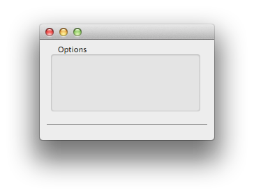
Here is an example demonstrating how to create a Box view. This
code also shows how to create a separator line (which is a box of type 2):
set root [view root Document -frame {120 150 250 150}]
set boxTkn [view create Box -frame {0 30 220 100} -parent $root]
view configure $boxTkn -title "Options"
set sepTkn [view create Box -frame {10 20 230 5} -parent $root]
view configure $sepTkn -type 2
view show $root
This code is illustrated in the following image:

Browser
The Browser view inherits from the NSControl class.
It thus supports all the options described in the Control Options section.
In addition, it supports the following specific options:
- -attr
- the -attr option lets you specify attributes for the view. See the possible values
below.
- -bgColor
- the -bgColor option lets you specify the background color. Its value
is a color token obtained with the [colorRef create] command.
- -doubleAction
- the -doubleAction option lets you specify the name of a Tcl proc to
invoke when the view is double-clicked.
The core appends the view's token to the arguments of the proc.
- -height
- the -height option lets you specify the height of the rows.
- -indexPath
- the -indexPath option is used to get or set the selection on a
single item. The value is a list of indices indicating the selected item at
each successive level. For instance, if you select the 2nd item in the
third column, and its parent is the 1st item of the second column whose
parent is the 3rd item of the first column, then the corresponding index
path is "2 0 1" (recall that indices are 0-based).
- -items
- the -items option lets you specify the contents of the browser view.
The value of this option is a tree list. See the Tree List Format section below for a description and an example of a tree
list. If the tree list is not correctly formatted, the command raises an
error.
- -max
- the -max option lets you specify the maximum number of columns displayed.
- -min
- the -min option lets you specify the minimum column width.
- -path
- the -path option is used to get or set the path representing the
currently opened container. The returned value is a string representing the
hierarchy of containers leading to the currently opened one (for instance
/dir1/dir11/file112). If it is prefixed by the path separator, the
path is considered absolute, i-e it represents the full path from the
browser's first column. Otherwise, the path is relative, extending the
browser's current path starting at the last column.
- -resizing
- the -resizing option lets you specify the column resizing style
of the view. See the possible values
below. The default value
is 2 (User Column Resizing).
- -selected
- the -selected option is used to specify the currently selected
items. If the Allows Multiple Selection attribute has been set,
there can be several selected items. Otherwise, there can be at most one.
The value of this option is a list of indexes of the selected items within
the currently opened container. In order to know or to specify which
container these items are located in, use the -path option.
- -width
- the -width option lets you specify the width of the columns. It does
nothing if the column resizing type is set to Auto Column
Resizing (see the -resizing
option).
The possible values for the -attr option are:
| Description | Value |
| Allows Branch Selection | 1 |
| Allows Empty Selection | 2 |
| Allows Multiple Selection | 4 |
| Allows Type Select | 8 |
| Titled | 16 |
| Separates Columns | 32 |
| Has Horizontal Scroller | 64 |
| Prefers All Column User Resizing | 256 |
| Takes Title From Previous Column | 512 |
By default, the following attributes are set:
Allows Empty Selection,
Allows Type Select,
Separates Columns,
Has Horizontal Scroller.
This corresponds to the value 106 (= 64 + 32 + 8 + 2).
The possible values for the -resizing option are:
| Description | Value |
| No Column Resizing | 0 |
| Auto Column Resizing | 1 |
| User Column Resizing | 2 |
Tree List Format
A tree list is a list with an even number of elements representing
alternatively the name and the contents of a node. If the contents is an
empty string, the node is a leaf, otherwise it corresponds to a container
and should also be a list with an even number of elements.
Here is an example of a tree list:
{file1 "" file2 "" dir1 {dir11 {file111 "" file112 ""} file11 "" file12 ""} dir2 {dir21 {file211 ""} file21 ""}}
It corresponds to the following hierarchy:
---
   |--- file1
   |--- file2
   |--- dir1
   |   |--- dir11
   |   |   |--- file111
   |   |   |--- file112
   |   |--- file11
   |   |--- file12
   |--- dir2
	   |--- dir21
	   |   |--- file211
	   |--- file21
Example
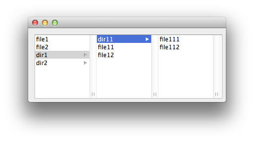
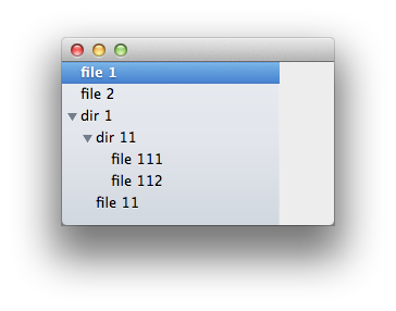
Here is now an example demonstrating how to create a Browser view:
set root [view root Document -frame {120 150 400 150}]
set broTkn [view create Browser -frame {0 0 380 130} -parent $root]
set hierlist {file1 "" file2 "" dir1 {dir11 {file111 "" file112 ""} file11 "" file12 ""}
	dir2 {dir21 {file211 ""} file21 ""}}
view configure $broTkn -attr 0 -items $hierlist
view show $root
This code is illustrated in the following image:

Button
The Button view inherits from the NSControl class.
It thus supports all the options described in the Control Options section.
In addition, it supports the following specific options:
- -allowMixed
- the -allowMixed option lets you specify whether the button allows a
mixed state. A check box for instance could have two states (on and off) or
three states (on, off, and mixed). The default value is 0. The state itself
is handled by the -state option.
- -altImage
- the -altImage option lets you specify the image displayed by the button
when it's in its alternate state.
- -altTitle
- the -altTitle option lets you specify the title that appears on the
button when it's in its alternate state.
- -bgColor
- the -bgColor option lets you specify the background color. Its value is
a color token obtained with the [colorRef create] command. Note that the
background color is used only when drawing borderless buttons.
- -bordered
- the -bordered option lets you specify whether the button has a bezeled
border.
- -image
- the -image option lets you specify the image to display in the view.
The value is an image token obtained with the [imageRef create] command.
- -key
- the -key option lets you specify the key equivalent character of the
button to the given character.
- -modifiers
- the -modifiers option lets you specify the mask indicating the modifier
keys used by the button's key equivalent. The modifiers are specified using
the same conventions as with the [menuItem] and the [binding] commands:
c for Command (⌘),
s for Shift (⇧),
o for Option (⌥).
Note that the Control modifier (⌃) is not supported
in the button's key-equivalent modifier mask.
- -position
- the -position option lets you specify the position of the button's
image relative to its title. See the possible values below.
- -sound
- the -sound option lets you specify the sound played when the user
presses the button. Its value is a sound token obtained with the
[soundRef create] command.
- -state
- the -state option lets you specify the button's state. See the possible values below.
- -style
- the -style option lets you specify the appearance of the border, if
the button has one. See the possible values below.
- -title
- the -title option lets you specify the title displayed by the button
when in its normal state.
- -transparent
- the -transparent option lets you specify whether the button is
transparent.
- -type
- the -type option lets you specify how the button highlights while
pressed and how it shows its state. See the possible values below.
The possible values for the -position option are:
| Description | Value |
| No Image | 0 |
| Image Only | 1 |
| Image Left | 2 |
| Image Right | 3 |
| Image Below | 4 |
| Image Above | 5 |
| Image Overlaps | 6 |
The possible values for the -state option are:
| Description | Value |
| Mixed State | -1 |
| Off State | 0 |
| On State | 1 |
The possible values for the -style option are:
| Description | Value |
| Rounded | 1 |
| Regular Square | 2 |
| Thick Square | 3 |
| Thicker Square | 4 |
| Disclosure | 5 |
| Shadowless Square | 6 |
| Circular | 7 |
| Textured Square | 8 |
| Help Button | 9 |
| Small Square | 10 |
| Textured Rounded | 11 |
| Round Rect | 12 |
| Recessed | 13 |
| Rounded Disclosure | 14 |
| Inline | 15 |
The possible values for the -type option are:
| Description | Value |
| Momentary Light Button | 0 |
| Push On Push Off Button | 1 |
| Toggle Button | 2 |
| Switch Button | 3 |
| Radio Button | 4 |
| Momentary Change Button | 5 |
| On Off Button | 6 |
| Momentary Push In Button | 7 |
Collection View
The CollectionView view inherits from the NSView class (not NSControl).
It thus supports all the options described in the View Options section.
In addition, it supports the following specific options:
- -attr
- the -attr option lets you specify attributes for the view. See the possible values
below.
- -bgColor
- the -bgColor option lets you specify the collection view's background color.
The value is a color token representing the color to use when
drawing the background grid and typically obtained with the [colorRef create] command.
- -command
- the -command option lets you specify a Tcl proc to execute each
time an item receives a mouse click. The core appends two arguments to the
proc: the collection view's token and the index path of the clicked item.
- -dataProc
- the -dataProc option lets you specify a Tcl proc invoked to
populate the elements of the Collection View when required. This proc is a
callback invoked with two arguments: the token of the collection view and
an index path (see the Mechanism section below). The prototype of the proc should thus be:
proc someProc {token indexPath} {
    # definition here
}
- -docviewFrame
- the -docviewFrame option lets you get the frame of the
collection view itself rather than the frame of its enclosing scroll view.
The dimensions of the collection view depend on the number of rows and columns
it contains.
- -dir
- the -dir option lets you specify the scroll direction of the collection
view. The flow layout scrolls along one axis only, either horizontally or
vertically. When the scroll direction is 0 (vertical scrolling), the width
of the content never exceeds the width of the collection view itself but
the height grows as needed to accommodate the current items. When the
scroll direction is 1 (horizontal scrolling), the height never exceeds the
height of the collection view but the width grows as needed. The default
value is 0 (vertical scrolling).
- -height
- the -height option lets you specify the height of the horizontal
section headers. This is used only if the layout direction is vertical (see
the -dir option). The default
value is 25.
- -items
- the -items option lets you specify a correspondance between tags and
subview tokens. Its value is a Tcl array (using the syntax of the [array get] or [array set] commands)
whose keys are integer tags and values are the token of the corresponding
subview in the template view (see the -view option).
- -labels
- the -labels option lets you specify titles for the sections.
It is a list of strings. If this option is specified, a header is drawn at
the top of each section displaying the corresponding label. If you specify
an empty list, the sections are named "Section 1", "Section 2", etc. If you do not want any title in the header views, specify a list
of empty strings.
- -num
- the -num option lets you specify the number of items in each section.
It is a list of integers. For instance, a value "7 5 2" means that there
are three sections, each one containing respectively 7, 5 and 2 items.
- -scrollTo
- the -scrollTo option lets you scroll the collection view. Its value is a two
elements list containing the coordinates of a point in the view that you
want to be positionned at the origin of the enclosing scroll view. Note
that collection views use a flipped coordinate system, so the origin is
the upper left corner.
- -selected
- the -selected option lets you specify the current selection of
items. If the Allows Multiple Selection attribute is set, the value
is a Tcl list of index paths, otherwise it is a single index path
(see below). To deselect
all the items, pass an empty string in the option.
Note that, since the collection view creates its items only when
necessary (see Collection View Mechanism below), a selection can
only be set on existing items. In particular, you can't set a selection
before the view is displayed onscreen.
- -selectProc
- the -selectProc option lets you specify a Tcl proc to invoke when
a collection view item has been selected. The core appends the view's
token and the index path of the selected item to the proc's arguments.
- -spacing
- the -spacing option lets you specify the inter-items spacing. It is a
two-element list corresponding to the following properties:
the minimum spacing (in points) to use between rows or columns
(minimumLineSpacing)
and the minimum spacing (in points) to use between items in the same row or
column
(minimumInteritemSpacing).
- -view
- the -view option lets you specify a template view.
This template is typically a view of type View
containing various subviews.
See explanations below.
- -width
- the -width option lets you specify the width of the vertical
section headers. This is used only if the layout direction is horizontal
(see the -dir option). The default
value is 100.
The possible values for the -attr option are:
| Description | Flag | Decimal |
| No Attributes | 0 | 0 |
| Selectable | 1 << 0 | 1 |
| Allows Multiple Selection | 1 << 1 | 2 |
| Allows Empty Selection | 1 << 2 | 4 |
Index path
Each element in a collection view is identified by an
index path: this is a two element list containing the index of the
section and the index of the item within the section. Indices are 0-based:
an index path "1 3" designates the fourth item of the second
section.
Mechanism
A collection view is an ordered collection of data items displayed in a
customizable layout. Each item is represented by a view which may contain
any number of subviews. For instance, a collection view could represent a
collection of images and each item view could display the image itself, its
name and dimensions.
A collection view may also organize its items in separate sections.
For instance, in the previous example, images could be photos grouped by
season or by event. The same element can be found in different sections.
For efficiency, the collection view does not create items until they
are needed, and usually it creates them only when they need to be displayed
onscreen. As a consequence, the items are built dynamically. The collection
view is populated via a data source which queries the necessary data when
necessary. You must provide the following elements:
- the number of sections and the number of elements in each section
so that the collection view can organize its layout. This is declared with
the -num option.
- a template view used to represent the data for each element. This is declared with
the -view option. Each
configurable subview of the template view should be identified by a tag.
- a Tcl proc invoked to populate the elements. This is declared with
the -dataProc option.
- a dictionary giving a mapping between the tags and the token of
the corresponding subviews. This is declared with
the -items option.
These four options are mandatory.
Remarks
- Alpha's Collection View comes with its own scroll view, so
there is no need to create a separate scroll view. A collection view has
only one scroller, horizontal or vertical depending on the value of the
-dir option.
- You can set a tool tip on each item by using the -help option inside the data proc declared with the
-dataProc option. At the moment
this proc is invoked, its token argument represents the collection item
being defined.
Example
Here is a complete workable example demonstrating how to create a
CollectionView view. It displays all the icons included in the
application and each item shows an image together with its name and size:
# Collect some data
set iconDir [file join $APPLICATION Contents Resources Icons]
set iconNames [glob -nocomplain -tails -dir $iconDir *.icns]
# Create a view prototype
set viewTkn [view create View -frame {0 0 160 90}]
set tagsDict [dict create]
# Add subviews: a name field, an image and a size field
set nameTkn [view create TextField -frame {10 64 140 21} -parent $viewTkn]
view configure $nameTkn -tag 1 -editable 0 -selectable 1 \
      -bordered 0 -drawsBackground 0
dict set tagsDict 1 $nameTkn
set imgTkn [view create ImageView -frame {5 5 50 50} -parent $viewTkn]
view configure $imgTkn -tag 2
dict set tagsDict 2 $imgTkn
set sizeTkn [view create TextField -frame {60 25 100 21} -parent $viewTkn]
view configure $sizeTkn -tag 3 -editable 0 -selectable 1 \
      -bordered 0 -drawsBackground 0
dict set tagsDict 3 $sizeTkn
# Define the data proc that fills the collection items
proc _setDataProc {token indexPath} {
    global iconDir iconNames
    set idx [lindex $indexPath 1]
    set fname [lindex $iconNames $idx]
    set path [file join $iconDir $fname]
    set icon [imageRef create -file $path]
    set size [file size $path]
    set nameTkn [view tag $token 1]
    view configure $nameTkn -string [file root $fname]
    set imgTkn [view tag $token 2]
    view configure $imgTkn -image $icon
    set sizeTkn [view tag $token 3]
    view configure $sizeTkn -string "$size bytes"
}
# Create a root window
set root [view root Document -frame {120 350 510 200}]
# Create a collection view
set collTkn [view create CollectionView -frame [list 0 0 510 200] -parent $root]
view configure $collTkn -attr 7 -num [llength $iconNames] -view $viewTkn \
            -dataProc _setDataProc -items $tagsDict
view show $root
This code is illustrated in the following image:

If necessary, one can force a reload of the collection view's data
using the [view refresh] command.
Color Well
The ColorWell view inherits from the NSControl class.
It thus supports all the options described in the Control Options section.
In addition, it supports the following specific options:
- -bordered
- the -bordered option lets you specify if the view has a border or not.
Possible values are 1 or 0 respectively. The default is 1. As a side
effect, if the option is set to 1, then clicking on the ColorWell
brings up the Color Picker: any changes made in the Color
Picker are automatically reflected by the ColorWell. If the
option is set to 0, then clicking and holding the mouse button lets you
drag a color swatch from the ColorWell.
- -color
- the -color option lets you specify the color currently displayed by
the view. The value is a color token obtained with the [colorRef create] command.
- -value
- the -value option lets you specify the color components directly rather
than via a color token. The value is a list of three or four floating numbers
between 0 and 1 representing the RGB components and an optional alpha
component (equal to 1 by default).
The color displayed by the ColorWell can be specified either by the
-color or the -value options. The latter is useful when the color is
temporary.
Example
Here is an example demonstrating how to create a ColorWell view:
set root [view root Document -frame {120 150 80 80}]
set color [colorRef create -space RGB 0.6 0.3 0.8]
set colTkn [view create ColorWell -frame {0 0 50 50} -parent $root]
view configure $colTkn -bordered 1 -color $color
view show $root
This code is illustrated in the following image:

In the previous example, one could have configured the color directly
like this:
view configure $colTkn -value [list 0.6 0.3 0.8]
Combo Box
The ComboBox view inherits from the NSTextField class.
It thus supports all the options described in the Control Options section and also the options
supported by the TextField view (see the Text Field section).
In addition, it supports the following specific options:
- -completes
- the -completes option lets you specify whether the combo box tries to
complete what the user types in the text field.
- -hasScroller
- the -hasScroller option lets you specify whether the combo box displays
a vertical scroller.
- -height
- the -height option lets you specify the height for items in the pop-up
list.
- -items
- the -items option lets you specify the list of items contained in the combo
box list.
- -num
- the -num option lets you specify the maximum number of items that are
visible in the combo box's pop-up list.
- -selected
- the -selected option lets you specify the index of the currently
selected item in the list.
- -spacing
- the -spacing option lets you specify the spacing between pop-up list items.
The value of the ComboBox view (that is to say the text displayed
in the combo box's text field) can be retrieved or set with the -string option.
Example
Here is an example demonstrating how to create a ComboBox:
set root [view root Document -frame {120 150 200 60}]
set cboTkn [view create ComboBox -frame {0 0 180 24} -parent $root]
view configure $cboTkn -items [list item1 item2 item3] \
    -placeholder "choose an item"
view show $root
This code is illustrated by the following image:

Control
The Control view inherits from the NSView class.
It lets you define a basic control which supports the options common to all
views described in the View Options section and the
options common to all controls described in the
Control Options section.
Date Picker
The DatePicker view inherits from the NSControl class.
It thus supports all the options described in the Control Options section.
In addition, it supports the following specific options:
- -bezeled
- the -bezeled option lets you specify whether the view draws a bezeled border.
- -bgColor
- the -bgColor option lets you specify the background color. Its value
is a color token obtained with the [colorRef create] command.
- -bordered
- the -bordered option lets you specify whether the view draws a plain border.
- -color
- the -color option lets you specify the text color of the view. The
value is a color token obtained with the [colorRef create] command.
- -dateValue
- the -dateValue option lets you specify the view's date to a new
starting value. The value can be either an integer representing the number
of seconds relative to 1 January 1970, GMT or a string in the international
string representation format (YYYY-MM-DD HH:MM:SS±HHMM). Note that
you must specify all the fields of the format string, including the time
zone offset, which must have a plus or minus sign prefix (for example,
2001-03-24 10:45:32+0600). The value returned by this option is
always in the integer form (number of seconds).
- -drawsBackground
- the -drawsBackground option lets you specify whether the view draws the background.
- -interval
- the -interval option lets you specify the time interval of the date
range. This only applies when the view is in the Range Date mode.
In that case, the -dateValue option corresponds to the first date
and the -interval option corresponds to the time between the first
date and the second date.
- -max
- the -max option lets you specify the maximum date allowed as input by
the view.
- -min
- the -min option lets you specify the minimum date allowed as input by
the view.
- -mode
- the -mode option lets you specify the date picker's mode. See the possible values
below. The Range Date mode is only applicable in the case of the
graphical style (Clock And Calendar Date).
- -style
- the -type option lets you specify the date picker's style. See the possible values
below.
- -type
- the -type option lets you specify the elements (days, months, hours,
minutes, etc.) displayed by the view. The value of this option is specified
by a bitmask. See the possible mask values below.
The possible values for the -mode option are:
| Description | Value |
| Single Date Mode | 0 |
| Range Date Mode | 1 |
The possible values for the -style option are:
| Description | Value |
| Text Field And Stepper Date | 0 |
| Clock And Calendar Date | 1 |
| Text Field Date | 2 |
The possible values for the -type option are:
| Description | Hex value | Dec value |
| Hour Minute Date Flag | 0x000c | 12 |
| Hour Minute Second Date Flag | 0x000e | 14 |
| Time Zone Date Flag | 0x0010 | 16 |
| Year Month Date Flag | 0x00c0 | 192 |
| Year Month Day Date Flag | 0x00e0 | 224 |
| Era Date Flag | 0x0100 | 256 |
Example
Here is an example demonstrating how to create a Date Picker:
set root [view root Document -frame {120 150 250 60}]
set datTkn [view create DatePicker -frame {0 0 230 30} -parent $root]
view configure $datTkn -dateValue [clock seconds]
view show $root
This code is illustrated in the following image:

The following code can be used to create a calendar view as in the
illustration below:
set root [view root Document -frame {120 150 200 180}]
set datTkn [view create DatePicker -frame {0 0 160 150} -parent $root]
view configure $datTkn -style 1 -type 192 -dateValue [clock seconds]
view show $root

Image View
The ImageView view inherits from the NSControl class.
It thus supports all the options described in the Control Options section.
In addition, it supports the following specific options:
- -alignImg
- the -alignImg option lets you specify the position of the image in the frame.
See the possible values below.
- -editable
- the -editable option lets you specify whether the user can drag a new image into the frame.
- -image
- the -image option lets you specify the image to display in the view. The value is an image
token obtained with the [imageRef create] command.
- -scaling
- the -scaling option lets you specify the way the image alters to fit the frame.
See the possible values below.
- -style
- the -style option lets you specify the kind of frame that borders the image.
See the possible values below.
The possible values for the -alignImg option are:
| Description | Value |
| Align Center | 0 |
| Align Top | 1 |
| Align Top Left | 2 |
| Align Top Right | 3 |
| Align Left | 4 |
| Align Bottom | 5 |
| Align Bottom Left | 6 |
| Align Bottom Right | 7 |
| Align Right | 8 |
The possible values for the -scaling option are:
| Description | Value |
| Scale Proportionally | 0 |
| Scale To Fit | 1 |
| Scale None | 2 |
with the following meaning:
- Scale Proportionally means that, if the image is too large, it shrinks
to fit inside the frame. The proportions of the image are preserved. The
image is never scaled up to fit a larger frame.
- Scale To Fit means that the image
shrinks or expands, and its proportions distort, until it exactly fits the
frame.
- Scale None means that the size and proportions of the image don't change. If
the frame is too small to display the whole image, the edges of the image
are trimmed off.
The possible values for the -style option are:
| Name | Value | Description |
| None | 0 | an invisible frame |
| Photo | 1 | a thin black outline and a dropped shadow |
| Gray Bezel | 2 | a gray, concave bezel that makes the image look sunken |
| Groove | 3 | a thin groove that looks etched around the image |
| Button | 4 | a convex bezel that makes the image stand out in relief, like a button |
Example
Here is an example demonstrating how to create an ImageView view:
set root [view root Document -frame {120 150 80 80}]
set icon [imageRef create -name Computer]
imageRef size $icon 70 70
set imgTkn [view create ImageView -frame {5 5 70 70} -parent $root]
view configure $imgTkn -image $icon
view show $root
This code is illustrated in the following image:

Level Indicator
The LevelIndicator view inherits from the NSControl class.
It thus supports all the options described in the Control Options section.
In addition, it supports the following specific options:
- -max
- the -max option lets you specify the maximum value the indicator can
represent.
- -min
- the -min option lets you specify the minimum value the indicator can
represent.
- -num
- the -num option lets you specify the number of tick marks displayed by
the indicator (which includes those assigned to the minimum and maximum
values).
- -position
- the -position option lets you specify where tick marks appear relative
to the indicator. See the possible values below.
- -style
- the -style option lets you specify the style of the indicator.
See the possible values below.
- -threshold
- the -threshold option lets you specify the critical value of the
indicator: when the current value reaches this value, the color of the
indicator turns red.
- -warningValue
- the -warningValue option lets you specify the warning value of the
indicator: when the current value reaches this value, the color of the
indicator changes from green to yellow.
The current value of the indicator can be set with the -value option.
The possible values for the -style option are indicated
in the following table:
| Name | Value | Description |
| Relevancy | 0 | A style that is used to indicate the relevancy of a search result. |
| ContinuousCapacity | 1 | A style that is often used to indicate how much data is on a hard disk. |
| DiscreteCapacity | 2 | A style similar to audio level indicators in iTunes. |
| Rating | 3 | A style similar to the star ranking displays provided in iTunes and iPhoto. |
The possible values for the -position option are indicated in the following table:
| Description | Value |
| Tick Mark Below | 0 |
| Tick Mark Above | 1 |
Their meaning depends on the orientation of the indicator
(horizontal or vertical) which is determined by the dimensions of the
frame. For a vertical indicator, one can use similarly:
| Description | Value |
| Tick Mark Right | 0 |
| Tick Mark Left | 1 |
Note that a level indicator can be made editable using the -editable
option.
Example
Here is an example demonstrating how to create various styles of
level indicators:
set root [view root Document -frame {120 150 350 160}]
set levTkn1 [view create LevelIndicator -frame {20 110 300 20} -parent $root]
view configure $levTkn1 -style 0 -min 0 -max 10 -value 7
set levTkn2 [view create LevelIndicator -frame {20 80 300 20} -parent $root]
view configure $levTkn2 -style 1 -min 0 -max 10 -value 3
set levTkn3 [view create LevelIndicator -frame {20 50 300 20} -parent $root]
view configure $levTkn3 -style 2 -min 0 -max 10 -value 5
set levTkn4 [view create LevelIndicator -frame {20 20 300 20} -parent $root]
view configure $levTkn4 -style 3 -min 0 -max 10 -value 7
view show $root
This code is illustrated in the following image:

Matrix
The Matrix view inherits from the NSControl class.
It thus supports all the options described in the Control Options section.
In addition, it supports the following specific options:
- -attr
- the -attr option lets you specify attributes for the view. See the possible values
below.
- -bgColor
- the -bgColor option lets you specify the background color. Its value
is a color token obtained with the [colorRef create] command.
- -doubleAction
- the -doubleAction option lets you specify the name of a Tcl proc to
invoke when the user double-clicks a cell.
The core appends the view's token to the arguments of the proc.
- -drawsBackground
- the -drawsBackground option lets you specify whether the view draws its
background.
- -help
- the -help option lets you specify tool tips for the cells. The value
is a list of strings corresponding to the different cells. The
cells are row-ordered: the first row's cells appears first in the list,
followed by the second row's cells, and so forth.
- -labels
- the -labels option lets you specify the titles of the matrix's cells.
The value is a list of strings corresponding to the different cells. The
cells are row-ordered: the first row of cells appears first in the list,
followed by the second row, and so forth. Still it is a plain list (not a
list of sublists).
- -mode
- the -mode option lets you specify the mode of the Matrix view.
See the possible values below.
- -num
- the -num option lets you specify the number of rows and columns in the
Matrix view. The value is a two-elements list containing the number
of rows and columns respectively. If only a single value is specified, the
number of columns is set to 1.
- -selected
- the -selected option is used to specify the selected cell or to
find the most recently selected cell. The cell is designated by a
two-elements list containing the row and column indices. In the case of a
single column, one can specify only one value corresponding to the row
index.
- -size
- the -size option lets you specify the width and height of each of the
cells in the matrix. The value is a two-elements list containing the width
and the height respectively. If only one value is specified, it applies to
both the width and the height. Note that since setting the -num option invokes internally a method adjusting the
matrix's frame so it exactly contains the cells, one must always set the
-size option before the -num
option.
- -spacing
- the -spacing option lets you specify the spacing between cells in the
matrix. The value is a two-elements list containing the horizontal and
vertical spacing.
- -view
- the -view option lets you specify a prototype object for the matrix's
cells. The value is a token for a view which contains a cell.
The possible values for the -attr option are:
| Name | Value | Description |
| No Attributes | 0 | no attribute is set |
| Allows Empty Selection | 1 | radio-mode matrix supports empty selection |
| Autoscroll | 2 | matrix is automatically scrolled |
| Autosizes Cells | 4 | matrix automatically resizes its cells |
| Selection By Rect | 8 | can select a rectangle of cells by dragging |
| Tab Key Traverses Cells | 16 | tab key advances current cell to next selectable |
The possible values for the -mode option are:
| Description | Value |
| Radio Mode | 0 |
| Highlight Mode | 1 |
| List Mode | 2 |
| Track Mode | 3 |
They have the following meaning:
- Radio Mode
- Selects no more than one cell at a time. Any time a cell is selected, the
previously selected cell is unselected.
- Highlight Mode
- A cell is highlighted before it's asked to track the mouse, then
unhighlighted when it's done tracking.
- List Mode
- Cell objects are highlighted, but don't track the mouse.
- Track Mode
- The cell objects are asked to track the mouse whenever the cursor is inside
their bounds. No highlighting is performed.
Note that when a -command is specified
on a Matrix view, the associated proc is invoked when a click occurs on
any of the cells: this proc takes two additional arguments (after the
token of the view) corresponding to the row and column indices of the clicked
cell. The prototype of the proc should thus be:
proc someProc {token row col} {
    # definition here
}
One may also identify the clicked cell using the -selected option.
Example
Here is an example demonstrating how to create a group of radio
buttons:
set root [view root Document -frame {120 150 250 120}]
set matTkn [view create Matrix -frame {0 0 210 100} -parent $root]
# Create a button prototype of type radiobutton
set btnTkn [view create Button -frame {0 0 16 16}]
view configure $btnTkn -type 4
# Configure the matrix
view configure $matTkn -view $btnTkn -size {100 25} -num 3 \
			  -labels [list "Choice1" "Choice2" "Choice3"] \
			  -selected 1
view show $root
This code is illustrated in the following image:

Movie View
The MovieView view inherits from the NSView class (not NSControl).
It thus supports all the options described in the Control Options section.
In addition, it supports the following specific options:
- -attr
- the -attr option lets you specify attributes for the view. See the
possible values below. By default, the value is set to 1 (stepping
buttons).
- -movie
- the -movie option lets you specify the current movie to display in the
view. The value is a movie token obtained with the [movieRef create] command.
- -style
- the -style option lets you specify the style of the controls pane
associated with the view. See the possible values below. By default, the
value is set to 1 (inline pane).
The possible values for the -attr option are a sum of the
following flags:
| Description | Flag |
| No Attributes | 0 |
| Show Stepping Buttons | 1 |
| Show Service Sharing Button | 2 |
| Show Full Screen Toggle Button | 4 |
The possible values for the -style option are:
| Description | Value |
| None | 0 |
| Inline | 1 |
| Floating | 2 |
| Minimal | 3 |
Outline View
An outline view is a single-column table whose elements are hierarchical :
like finder items some of them can "contain" other elements and can be
expanded or collapsed. This is a simplified implementation of the Cocoa
outline view (which can have additional columns).
The OutlineView view inherits from the NSTableView class which itself inherits
from the NSControl class.
It thus supports all the options described in the Control Options section and also supports the options specific to the Table View. In particular
the following options have the exact same meaning as with the Table View:
-attr,
-bgColor,
-color,
-doubleAction,
-height,
-resizing,
-spacing.
The following options have a different meaning or a different syntax:
- -items
- the -items option lets you specify the contents of the outline view.
The value of this option is a tree list : see the Tree List Format section for a description and an example of a tree
list. If the tree list is not correctly formatted, the command raises an
error.
- -labels
- the -labels option lets you specify the name of the column. If this
option is not specified, the column does not have a header.
- -num
- the -num option is ignored since the outline view has a single column.
The returned value is always 1.
- -selected
- the -selected option lets you specify which items are selected.
Depending on the selection mode (see the -attr option), one or several
items may be selected simultaneously.
The value of this option is a list of row indices. Note that, since items
can be expanded or collapsed, it is difficult to keep track of the exact
index of a row: you should rather use the -indexPath option.
In addition, the outline view supports the following specific options:
- -collapsed
- the -collapse option lets collapse a container item. The value is the
index of the row you want to collapse (obviously it must be a container row).
When the option is used with no value, it returns a list of row indices of
all the currently collapsed items. Passing a negative value collapses all
the items.
- -docviewFrame
- the -docviewFrame option lets you get the frame of the
outline view itself rather than the frame of its enclosing scroll view.
The dimensions of the outline view depend on the number of rows
it contains.
- -expanded
- the -expand option lets expand a container item. The value is the
index of the row you want to expand (obviously it must be a container row).
When the option is used with no value, it returns a list of row indices of
all the currently expanded items. Passing a negative value expands all
the items.
- -indexPath
- the -indexPath option is used to get or set the selection on a
single item. The value of this option has the same meaning as with the
-indexPath option of the Browser view.
- -scrollTo
- the -scrollTo option lets you scroll the outline view. Its value is a two
elements list containing the coordinates of a point in the view that you
want to be positionned at the origin of the enclosing scroll view. Note
that outline views use a flipped coordinate system, so the origin is
the upper left corner.
- -selectProc
- the -selectProc option lets you specify a Tcl proc to invoke when
the selection of the OutlineView has changed. The core appends the view's
token to the arguments of the proc.
- -style
- the -style option lets you specify the selection highlight style. See
the possible values below. The default value is 1 and corresponds to the Finder like style.
The possible values for the -style
option are:
| Description | Value |
| No Hilight Style | -1 |
| Regular Hilight Style | 0 |
| SourceList Hilight Style | 1 |
Remarks
- Alpha's Outline View comes with its own scroll view, so there is no
need to create a separate scroll view. The horizontal and vertical
scrollers can be deactivated using the -attr option.
Example
Here is an example demonstrating how to create an OutlineView:
set root [view root Document -frame {120 150 250 150}]
set ovTkn [view create OutlineView -frame {0 0 200 150} -parent $root]
set hierlist {"file 1" "" "file 2" "" "dir 1" {"dir 11" {"file 111" ""  "file 112" ""} "file 11" ""} }
view configure $ovTkn -attr 7 -items $hierlist -expanded -1
view show $root
The -expanded -1 option means expand all the items.
The -attr 7 option means no headers and no scrollers.
This code is illustrated in the following image:

Path Control
The PathControl view inherits from the NSControl class.
It thus supports all the options described in the Control Options section.
In addition, it supports the following specific options:
- -bgColor
- the -bgColor option lets you specify the background color. Its value
is a color token obtained with the [colorRef create] command.
- -doubleAction
- the -doubleAction option lets you specify the name of a Tcl proc to
invoke when the view is double-clicked. See the prototype below.
- -placeholder
- the -placeholder option lets you specify the text of a dummy
informative string inside the path control.
- -style
- the -style option lets you specify the path style. See the possible
values below. The default is the Standard style.
- -url
- the -url option lets you specify the value of the path displayed by
the view.
The possible values for the -style option are:
| Description | Value |
| Standard | 0 |
| Navigation Bar | 1 |
| Pop Up | 2 |
The procs attached to a PathControl with the -command
or the -doubleAction options take a second argument (after the
token of the view) corresponding to the partial path up to the clicked
component. The prototype of these procs should thus be:
proc someProc {token path} {
	# definition here
}
Example
Here is an example demonstrating how to create a PathControl view:
set root [view root Document -frame {120 150 450 60}]
set patTkn [view create PathControl -frame {0 0 430 40} -parent $root]
view configure $patTkn -url file:///Applications/Utilities/Terminal.app
view show $root
This code is illustrated in the following image:

PDF View
The PDFView view inherits from the NSView class (not NSControl).
It thus supports all the options described in the View Options section.
In addition, it supports the following specific options:
- -attr
- the -attr option lets you specify attributes for the view. See the possible values
below. The default value is 24 which means
that the Displays Page Breaks and Should Anti Alias
attributes are enabled.
- -back
- this option has to do with the history of page navigation maintained by the
view. Used with no argument, the -back option indicates whether
there is a previous location in the history. Used with an argument (any
value will do), this option displays the previously visited page.
- -bgColor
- the -bgColor option lets you specify the color of the PDF view’s
background, that is to say the area displayed to either side of a PDF
document’s pages. The background also appears between pages when page
breaks are enabled. The default color is a 50% gray. The value of this
option is a color token (typically obtained with the [colorRef create] command).
- -command
- the -command option lets you specify a Tcl proc to invoke when the
user clicks on a page of the PDF document. The declared proc must take four
arguments representing the view's token, the zero-based page index and the
x and y coordinates of the clicked location in page space coordinates,
respectively. The prototype of this proc should look like this:
proc myCommandProc {token page x y} {
    # your definition here
}
If you need to determine, within this proc, if a modifier key was pressed,
use the [getModifiers] command.
- -forward
- this option has to do with the history of page navigation maintained by the
view. Used with no argument, the -forward option indicates whether
there is a next location in the history. Used with an argument (any value
will do), this option displays the next visited page.
- -mode
- the -mode option lets you specify the current display mode. See the
possible values in the table below.
The default value is 1 (Single Page Continuous).
- -notifyProc
- the -notifyProc option lets you specify a Tcl proc to invoke when
an aspect of the PDFView has changed or a new value has been selected. The
declared proc must take two arguments representing the view's token and the
name of the notification sent by the view. Depending on the notification,
your proc can take any appropriate action (for instance, updating the
buttons of your interface). The notification names are given in the table below. The prototype of
the proc should look like this:
proc myNotifyProc {token notification} {
    # your definition here
}
- -scaling
- the -scaling option lets you specify the current scaling on the
displayed PDF document. Its value is a floating number. The default is 1.0
(actual size). Note that setting a new scale factor via this option
automatically disables the Auto Scaling attribute.
- -threshold
- the -threshold option lets you specify the greeking threshold
to apply to text displayed. It is the threshold under which the automatic
rendering of text characters makes use of unreadable symbols or lines,
either to speed up screen display or because the display capabilities of
the monitor are insufficient for rendering extremely small texts. Its value
is a floating number. The default value is 0.0.
- -url
- the -url option lets you specify the URL of a file to display in the PDFView.
The possible values for the -attr option are:
| Name | Value | Description |
| Allows Dragging | 1 | Determines whether the view can accept new PDF documents dragged into it by the user. |
| Auto Scales | 2 | Determines whether autoscaling is set. |
| Displays As Book | 4 | Determines whether the view will display the first page as a book cover (for two-up modes). |
| Displays Page Breaks | 8 | Determines whether the view is displaying page breaks. |
| Should Anti Alias | 16 | Determines whether the view is anti-aliased. |
The possible values for the -mode option are:
| Mode | Value | Description |
| Single Page | 0 | Display one page at a time horizontally and vertically. Scrolling apply only to the current page. |
| Single Page Continuous | 1 | Display in continuous mode vertically, with single-page width horizontally. Vertical scrolling applies to the entire document. |
| Two Up | 2 | Display two pages side-by-side. Scrolling apply only to the pair of displayed pages |
| Two Up Continuous | 3 | Display in continuous mode vertically with two pages side-by-side horizontally. Vertical scrolling applies to the entire document. |
The notification names received by the proc declared with the -notifyProc option are:
| Name | Description |
| PDFViewChangedDocument | a new document is associated with the view. |
| PDFViewChangedHistory | the page history has changed. |
| PDFViewChangedPage | a new page becomes current. |
| PDFViewScaleChanged | the scale has changed. |
| PDFViewSelectionChanged | the current selection has changed. |
| PDFViewDisplayModeChanged | the display mode has changed. |
The $pdfToken command
When a new PDFView is created, Alpha dynamically creates a command
that lets you interact with the displayed document. The name of the
command is the view's token. So, for instance, the following instruction:
set pdfToken [view create PDFView -frame {120 150 350 600}]
automatically creates a command called $pdfToken. The complete
syntax of this command is described in the [$pdfToken] help page.
Remarks
- The PDFView view comes with its own scroll view, so there is no
need to enclose it in a ScrollView.
- The PDFView view also comes with its own contextual menu which contains useful
commands to navigate to the previous or next page, to resize the window
(zoom in or out) and to change the display mode.
- The PDFView view maintains a back-forward list which keeps
track of the visited pages. The -back
and -forward options let you check the
possibility of displaying the previous or next location in the history
and let you go thereto.
Example
Here is an example demonstrating how to create a PDFView
view:
set root [view root Document -frame {120 150 350 600}]
set pdfTkn [view create PDFView -frame {10 10 330 580} -parent $root]
set viewHelp [file join $HOME Help latex_guide.pdf]
view configure $pdfTkn -url "file://$viewHelp" -flexibility 18
view show $root
This code is illustrated in the following image:

Pop Up Button
The PopUpButton view inherits from the NSButton class.
It thus supports all the options described in the Control Options section
and the options described in the Button section.
There are two different kinds of PopUpButton views: buttons
with a pop-up menu and buttons with a pull-down list. This can be set using
the -pullsDown option. By default,
Alpha creates pop-up menu buttons.
The PopUpButton view supports the following specific options:
- -arrow
- the -arrow option lets you specify the position of the arrow displayed
on the view. See the possible values below.
- -edge
- the -edge option lets you specify the edge of the button next to which
the pop-up menu should appear under restrictive screen conditions. For
pull-down menus, the default behavior is to display the menu under the
button. For most pop-up menus, the view attempts to show the selected
item directly over the button. See the possible values below.
- -items
- the -items option lets you specify a list of items to populate the
pop-up button's menu. This option is an alternative to the -menu option. See discussion below.
- -menu
- the -menu option lets you specify a menu associated with the pop-up
button. Its value is a menu token obtained with the [menuRef create] command. This option is an alternative to the -items option. See discussion below.
- -pullsDown
- the -pullsDown option lets you specify whether the button operates as a
pull-down menu or as a pop-up menu. The value is 1 or 0 respectively. The
default is 0.
- -selected
- the -selected option lets get or set the index of the selected
item in the popup button. The value -1 corresponds to no selection.
- -title
- the -title option lets get the title of the item last selected by
the user or set the string displayed in the button when the user isn't
pressing the mouse button. If the button displays a pop-up menu, setting
this option changes the current item to be the item with the specified
title, adding a new item by that name if one does not already exist. If the
button displays a pull-down list, this option sets the title of the first
item to the specified string: this item will reflect the selected item. For
the -title option to work, the -useItem option must be set to 0.
- -useItem
- the -useItem option lets you specify whether the pop-up button uses the
first menu item from the menu as its own title. The default is 1. For
pop-up menus, the pop-up button uses the title of the currently selected
menu item; if no menu item is selected, the pop-up button displays no item
and is drawn empty. You can set the title of a pop-up button to something
permanent by first setting this option to 0, then setting the -title option.
Note that the -image option (inherited from the Button view) has no
effect in the case of a PopUpButton: the image displayed in a pop up button
is taken from the selected menu item (in the case of a pop up menu) or
from the first menu item (in the case of a pull-down menu).
The possible values for the -arrow option are:
| Description | Value |
| No Arrow | 0 |
| Arrow At Center | 1 |
| Arrow At Bottom | 2 |
PopUp arrow At Bottom means that the arrow is drawn at the edge of
the button, pointing toward the preferred edge specified with the -edge option. PopUp arrow At Center means that the arrow is centered
vertically, pointing toward the preferred edge.
The possible values for the -edge option are:
| Name | Value | Description |
| Min X Edge | 0 | left edge of the input rectangle |
| Min Y Edge | 1 | bottom edge of the input rectangle |
| Max X Edge | 2 | right edge of the input rectangle |
| Max Y Edge | 3 | top edge of the input rectangle |
Most of the options of the Button view are irrelevant in the case of a
PopUpButton. Only the -bordered option can be useful.
There are two ways of populating the menu associated with a PopUpButton :
- using the -items option and
specifying a list of items. In that case, the core takes care of building a
menu internally and disposing of it when the button is deleted. When an item
is selected by the user, the proc attached to the PopUpButton (if
any) is invoked. The index of the selected item is obtained using the
-selected option.
- using the -menu option and
specifying a preexisting menu. This is useful if the menu is going to be
reused later. When an item is selected by the user, the proc attached to
the menu (if any) is invoked.
Beware that the proc attached to a control view has one argument which is
the view's token whereas the proc attached to a menu has two arguments
which are the menu's token and the item's name.
Example
Here is an example demonstrating how to create a PopUpButton of
type popup:
set root [view root Document -frame {120 150 150 50}]
set popTkn [view create PopUpButton -frame {0 0 120 25} -parent $root]
view configure $popTkn -items [list item1 item2 item3]
view show $root
This code is illustrated in the following images:


Here is now an example demonstrating how to create a PopUpButton of
type pulldown:
set root [view root Document -frame {120 150 150 50}]
set pulTkn [view create PopUpButton -frame {0 0 120 25} -parent $root]
view configure $pulTkn -items [list "" item1 item2 item3] -pullsDown 1 \
	-useItem 0 -title "Choose item"
view show $root
This code is illustrated in the following images:


Predicate Editor
The PredicateEditor view inherits from the NSControl class.
It thus supports all the options described in the Control Options section.
In addition, it supports the following specific options:
- -docviewFrame
- the -docviewFrame option lets you get the frame of the
predicate editor itself rather than the frame of its enclosing scroll view.
The dimensions of the predicate editor depend on the number of items
it contains.
- -height
- the -height option lets you specify the row height.
- -items
- the -items option lets you specify row templates. The syntax for this
option is described below.
- -num
- the -num option lets you specify how many rows the predicate editor
should initially display. The first row is a compound predicate
row and is always present. By default, this option is equal to 1.
- -scrollTo
- the -scrollTo option lets you scroll the view. Its value is a two
elements list containing the coordinates of a point in the view that you
want to be positionned at the origin of the enclosing scroll view. Note
that predicate editors use a flipped coordinate system, so the origin is
the upper left corner.
- -string
- the -string option lets you obtain a string representation of the
predicate represented by the PredicateEditor view. It is the same
string as returned by the [predicate format] command. This
option is read-only.
- -value
- the -value option lets you obtain a token corresponding to the
predicate represented by the PredicateEditor view. This option is
read-only. The token can be used to evaluate the predicate (see the
documentation of the [predicate eval] command).
Alpha's Predicate Editor comes with its own scroll view, so
there is no need to create a separate scroll view.
A PredicateEditor view contains rows representing comparison
predicates or compound predicates (see the documentation of
the [predicate] command). Each row displays two round
buttons with a minus and a plus sign respectively. Clicking on the minus
button removes the row. Clicking on the plus button inserts a new comparison row. If the option key (⌥) is pressed, the
plus button displays three dots ... and clicking on the button
inserts a new compound row.
Compound rows contain a popup menu with items indicating how the
predicates it contains must be evaluated. There are three possibilities:
- All specifies that all the children predicates must be
satisfied;
- Any specifies that at least one of the children predicates
must be satisfied;
- None negates the predicate. None of the children predicates
must be satisfied.
The -items option is
used to specify templates for the comparison rows. Its
value is a list of sublists.
Each item in the list is a sublist of one of two forms:
key operators (date|float|integer|string) ?options?
key operators list values ?options?
The items of these sublists have the following meaning:
- the first item is a key for the left hand expression of a comparison predicate.
- the second item is a list of operators. Possible values for the
operators are: <, <=, >, >=, = (or
==), != (or <>), begins, between,
contains, ends, in, like, matches.
The like operator indicates that the left hand expression equals
the right-hand expression in which ? and * are allowed as
wildcard characters, where ? matches 1 character and *
matches 0 or more characters. The matches operator indicates that
the left hand expression equals the right hand expression using a regular
expression.
- the third item is a keyword indicating the type of the right hand side
expression of the predicate. The possible types are: date, float, integer, list, string. If the type is
list, then the fourth argument is a list of values.
- the last item specifies comparison options using any combination of
the letters
c (case insensitive), d (diacritic insensitive)
and l (locale insensitive).
Here is an example of -items
option demonstrating different possibilities :
-items [list \
  [list name {between contains begins ends} string "cd"] \
  [list age [list "<" ">" "=" "!="] integer] \
  [list date [list "<" ">"] date] \
  [list height [list "<=" ">="] float] \
  [list version [list "=" "!="] list {1.0 1.2 1.3}]]
These template rows are illustrated in the following image:

The -items option describes a template, that is to
say it describes the possible rows that a user might specify in a
Predicate Editor view by clicking on the plus buttons. The previous image
indicates that the user pressed several times the plus button and chose
successively a predicate row of type name, then age, date, height, version. She might have selected fewer or
more conditions.
Progress Indicator
The ProgressIndicator view inherits from the NSView class (not NSControl).
It thus supports all the options described in the View Options section.
In addition, it supports the following specific options:
- -bezeled
- the -bezeled option lets you specify whether the indicator's frame has
a bezel. Possible values are 0 or 1. The default is 1.
- -determinate
- the -determinate option lets you specify whether the indicator is
determinate. A determinate indicator displays how much of the task has been
completed. An indeterminate indicator shows simply that the application is
busy.
- -max
- the -max option lets you specify the maximum value of the progress
indicator. An indeterminate progress indicator does not use this value.
- -min
- the -min option lets you specify the minimum value of the progress
indicator. An indeterminate progress indicator does not use this value.
- -size
- the -size option lets you specify the size of the indicator. In the
case of an indeterminate bar, it only affects the size of the stripes (one
must explicitely change the size of the frame to get a smaller bar).
See the possible values below.
- -type
- the -type option lets you specify the type of the progress indicator
(bar or spinning). See the possible values below.
- -value
- the -value option lets you specify the current extent of a determinate progress indicator.
An indeterminate progress indicator does not use this value.
The possible values for the -size option are:
| Description | Value |
| Regular Control | 0 |
| Small Control | 1 |
The possible values for the -type option are:
| Description | Value |
| Bar Style | 0 |
| Spinning Style | 1 |
Example
Here is an example demonstrating how to create a ProgressIndicator:
set root [view root Document -frame {120 150 200 50}]
set progTkn [view create ProgressIndicator -frame {0 0 120 25} -parent $root]
view configure $progTkn -determinate 1 -min 10 -max 100 -value 40
view show $root
This code is illustrated in the following image:

Scroller
The Scroller view inherits from the NSControl class.
It thus supports all the options described in the Control Options section.
In addition, it supports the following specific options:
- -proportion
- the -proportion option lets you specify the portion of the knob slot
the knob should fill. It is a floating-point value from 0.0 (minimal size) to
1.0 (fills the slot).
- -size
- the -size option lets you specify the control's size. See the possible
values below.
- -style
- the -style option lets you specify the style of the scroller. See the possible
values below.
- -type
- the -type option lets you specify the knob style used by the scroller.
See the possible values below.
The possible values for the -size option are:
| Description | Value |
| Regular Control Size | 0 |
| Small Control Size | 1 |
| Mini Control Size | 2 |
The possible values for the -style option are:
| Description | Value |
| Legacy Scroller Style | 0 |
| Overlay Scroller Style | 1 |
The possible values for the -type option are:
| Description | Value |
| Default Knob | 0 |
| Dark Knob | 1 |
| Light Knob | 2 |
Scroll View
The ScrollView view inherits from the NSView class (not NSControl).
It thus supports all the options described in the View Options section.
In addition, it supports the following specific options:
- -attr
- the -attr option lets you specify attributes for the view. See the possible values
below. The default value is 3 which means that the view has both a
horizontal and a vertical scroller.
- -bgColor
- the -bgColor option lets you specify the background color. Its value
is a color token obtained with the [colorRef create] command.
- -docviewFrame
- the -docviewFrame option lets you get or set the frame of the
document view that is enclosed in the scroll view (rather than the frame
of the scroll view itself).
- -drawsBackground
- the -drawsBackground option lets you specify whether the view draws its
background.
- -lineScroll
- the -lineScroll option lets you specify the amount of the scrolled view
kept visible when scrolling line by line, expressed in the content view's
coordinate system. The value is a two-elements list containing the
horizontal and the vertical amount; if only one value is specified, it
applies to both horizontal and vertical scrolling.
- -pageScroll
- the -pageScroll option lets you specify the amount of the scrolled view
kept visible when scrolling page by page, expressed in the content view's
coordinate system. The value is a two-elements list containing the
horizontal and the vertical amount; if only one value is specified, it
applies to both horizontal and vertical scrolling.
- -scrollTo
- the -scrollTo option lets scroll the scroll view. Its value is
a two elements list containing the coordinates of a point in the scroll
view's document view that you want to be positionned at the origin (lower
left corner) of the scroll view.
- -type
- the -type option lets you specify the border type of the view. See the possible values
below.
- -view
- the -view option lets you specify the view which is scrolled by the
ScrollView.
The possible values for the -attr option are any
combination of the following flags:
| Description | Flag |
| No Attributes | 0 |
| Has Horizontal Scroller | 1 |
| Has Vertical Scroller | 2 |
| Autohides Scrollers | 4 |
| Scrolls Dynamically | 8 |
| Has Horizontal Ruler | 16 |
| Has Vertical Ruler | 32 |
| Rulers Visible | 64 |
The possible values for the -type option are:
| Description | Value |
| No Border | 0 |
| Line Border | 1 |
| Bezel Border | 2 |
| Groove Border | 3 |
Search Field
The SearchField view inherits from the NSTextField class. It thus
supports all the options described in the Control Options section and also some of the options supported by the TextField view:
-attr,
-color,
-filter,
-placeholder,
-style
(see the Text Field section).
In addition, it supports the following specific options:
- -continuous
- the -continuous option lets you specify whether the Search Field
executes incremental searches or not. If it is set to 1, it invokes the
action proc (specified with the -command option) after each keystroke, otherwise it calls it only when the user
clicks the search button (or presses return). The default value is 0
(i-e non-incremental search).
- -max
- the -max option lets you specify the maximum number of search
strings that can appear in the search menu.
- -menu
- the -menu option lets you specify a menu template used to dynamically
construct the Search Field's pop-up menu. If this option is not set, the
Alpha's core provides a menu template anyway. The Search Field makes use of
menu item tags to identify some key elements of the menu template in order
to build the displayed menu. You can set the following tags using the
-tag option of the [menuItem] command:
| Name | Value |
| Recent Items Title | 1000 |
| Recent Items | 1001 |
| Clear Recents | 1002 |
| No Recents | 1003 |
The tagged menu items serve the following purpose:
- Recent Items Title
- Identifies the menu item that is the title of the menu group for recent
search strings. This item is hidden if there are no recent strings.
- Recent Items
- Identifies where recent search strings should appear in the "recents" menu
group.
- Clear Recents
- Identifies the menu item for clearing the current set of recent string
searches in the menu. This item is hidden if there are no recent strings.
- No Recents
- Identifies the menu item that describes a lack of recent search strings
(for example, "No recent searches"). This item is hidden if there have been
recent searches.
- -searches
- the -searches option lets you specify a list of recent search
strings to list in the pop-up menu of the Search Field.
Example
Here is an example demonstrating how to create a Search Field:
set root [view root Document -frame {120 150 150 50}]
set seaTkn [view create SearchField -frame {10 10 130 24} -parent $root]
view configure $seaTkn -style 1 -string "Alpha"
view show $root
This code is illustrated in the following image:

Secure Text Field
The SecureTextField view inherits from the NSTextField class.
It thus supports all the options described in the
Control Options section and also the options
supported by the TextField view (see the Text Field section).
In addition, it supports the following specific option:
- -echo
- the -echo option lets you specify whether the SecureTextField echoes
bullets for each character typed. If the value is 1, bullets are echoed. If
it is 0, the cursor is moved for each character typed, but nothing is
displayed. The default is 1.
Example
Here is an example demonstrating how to create a secure text field:
set root [view root Document -frame {120 150 150 50}]
set secTkn [view create SecureTextField -frame {10 10 130 24} -parent $root]
view configure $secTkn -style 1 -placeholder "Enter secret code"
view show $root
This code is illustrated in the following image:

Segmented Control
The SegmentedControl view inherits from the NSControl class.
It thus supports all the options described in the Control Options section.
A segmented control can be thought of as a horizontal button divided into
multiple segments. Each segment of the view is a button and can receive a
label, an image, a menu, a help string. Most of the options below accept a
list of values instead of a single value, each value being affected to the
corresponding segment.
The segmented control can have different behaviors with respect to the way
in which selections are handled (see the -mode option).
In addition, it supports the following specific options:
- -enabled
- the -enabled option lets you specify the enabled state of the
segments. The value is a list of boolean values (0 or 1) corresponding to
each of the segments.
- -help
- the -help option lets you specify tool tips for the segments. The value
is a list of strings corresponding to each of the segments. An empty string
in the list means that no tool tip is required for the corresponding segment.
If the list contains only one item, it is installed as a tool tip for the
entire view.
- -image
- the -image option lets you specify a list of images to display in the
segments of the view. The value is a list of image tokens obtained with the
[imageRef create] command. An empty string in the list means that no image
is required for the corresponding segment. If an image is too large to fit
in a segment, it is clipped.
- -items
- the -items option lets you specify the text of the segments. The value
is a list of strings corresponding to each of the segments.
- -menu
- the -menu option lets you specify menus attached to the segments. If a
menu is attached to a segment, this segment behaves like a popup button.
The value is a list of menu tokens obtained with the [menuRef create]
command and corresponding to each of the segments. An empty string in
the list means that no menu is required for the corresponding segment.
- -mode
- the -mode option lets you specify the tracking mode. See the possible
values below. The
default is 0 (Select One).
- -num
- the -num option lets you specify the number of segments in the control.
- -selected
- the -selected option lets you specify which segments are selected.
Depending on the tracking mode (see the -mode option), one or several segments may be
selected simultaneously. If the mode is Select One or Momentary, the value of the option is the index of the selected segment. If the
mode is Select Any, the value of the option is a list of boolean
values (as many as there are segments) telling whether the corresponding
segment is selected or not.
- -size
- the -size option lets you specify the control's size. See the possible
values below.
- -style
- the -style option lets you specify the visual style of the control. See
the possible values below.
- -width
- the -width option lets you specify the width of the segments. The value
is a list of widths, measured in points, corresponding to each of the
segments. Specify the value 0 if you want a segment to be sized to fit the
available space automatically.
In order to attach an action to a SegmentedControl view, you
declare a Tcl proc using the -command
option as with any control: the proc takes a second argument (after the
token of the view) corresponding to the index of the clicked
segment. The prototype of the proc should thus be:
proc someProc {token segment} {
	# definition here
}
One may also identify the clicked segment using the -selected option.
The segment indices are 0-based: the first segment has index 0.
The possible values for the -mode option are:
| Mode | Value | Description |
| Select One | 0 | only one segment may be selected |
| Select Any | 1 | any segment can be selected |
| Momentary | 2 | a segment is selected only when tracking |
The possible values for the -size option are:
| Description | Value |
| Regular Control Size | 0 |
| Small Control Size | 1 |
| Mini Control Size | 2 |
The possible values for the -style option are:
| Description | Value |
| Automatic | 0 |
| Rounded | 1 |
| Textured Rounded | 2 |
| Round Rect | 3 |
| Textured Square | 4 |
| Capsule | 5 |
| Small Square | 6 |
The default value is 0 (Automatic) which means that the appearance
is automatically determined based on the type of window in which the
control is displayed and the position within the window.
Example
Here is an example demonstrating how to create a Segmented Control
(the second segment is disabled and the third one is selected):
set root [view root Document -frame {120 150 280 100}]
set segTkn [view create SegmentedControl -frame {0 0 250 80} -parent $root]
view configure $segTkn -num 3 -items [list Segment1 Segment2 Segment3] \
	-enabled {1 0 1} -selected 2
view show $root
This code is illustrated in the following image:

Slider
The Slider view inherits from the NSControl class.
It thus supports all the options described in the Control Options section.
In addition, it supports the following specific options:
- -max
- the -max option lets you specify the maximum value of the slider. A
horizontal slider sends its maximum value when its knob is all the way to
the right; a vertical slider sends its maximum value when its knob is at
the top.
- -min
- the -min option lets you specify the minimum value of the slider. A
horizontal slider sends its minimum value when its knob is all the way to
the left; a vertical slider sends its minimum value when its knob is at the
bottom.
- -num
- the -num option lets you specify the number of tick marks (including
those assigned to the minimum and maximum values) displayed by the slider.
By default, this value is 0, and no tick marks appear. The number of tick
marks assigned to a slider, along with the slider's minimum and maximum
values, determines the values associated with the tick marks.
- -position
- the -position option lets you specify a constant indicating the position of the tick marks.
- -type
- the -type option lets you specify the type of the slider. See the
possible values below.
The possible values for the -position option are:
| Description | Value |
| Tick Mark Below | 0 |
| Tick Mark Above | 1 |
| Tick Mark Left | 1 |
| Tick Mark Right | 0 |
The possible values for the -type option are:
| Name | Value | Description |
| Linear Slider | 0 | a bar-shaped slider |
| Circular Slider | 1 | a circular slider; that is, a dial |
The current value of the slider can be set with the -value option.
Note that the order in which the options are set matters: one must set the
-min and -max options before
the -value option.
In order to obtain to obtain a vertical slider, it is enough to set
the frame of the view so that the height is greater than the width.
Example
Here is an example demonstrating how to create a linear slider:
set root [view root Document -frame {120 150 250 50}]
set sliTkn [view create Slider -frame {0 0 230 20} -parent $root]
view configure $sliTkn -min 20 -max 100 -value 75
view show $root
This code is illustrated in the following image:

Split View
The SplitView view inherits from the NSView class (not NSControl).
It thus supports all the options described in the View Options section.
In addition, it supports the following specific option:
- -vertical
- the -vertical option lets you specify whether the split bars are vertical.
The SplitView stacks several subviews within one view so that the user
can change their relative sizes by moving the separator bar. By default,
the split bars between the views are horizontal, so the views are one on
top of the other. The subviews of the SplitView are embedded using
the [view add] command.
Stepper
The Stepper view inherits from the NSControl class.
It thus supports all the options described in the Control Options section.
In addition, it supports the following specific options:
- -increment
- the -increment option lets you specify the amount by which the view changes with each decrement or increment.
- -max
- the -max option lets you specify the maximum value for the stepper.
- -min
- the -min option lets you specify the minimum value for the stepper.
The current value of the slider can be set with the -value option.
The order in which the options are set matters (see the remark in the
Slider section).
Example
Here is an example demonstrating how to create a stepper:
set root [view root Document -frame {120 150 350 160}]
set steTkn [view create Stepper -frame {0 0 25 25} -parent $root]
view configure $steTkn -min 20 -max 100 -increment 5
view show $root
This code is illustrated in the following image:

Tab View
The TabView view inherits from the NSView class (not NSControl).
It thus supports all the options described in the View Options section.
In addition, it supports the following specific options:
- -command
- the -command option lets you specify a Tcl proc to execute each time a
tab has been selected.
- -drawsBackground
- the -drawsBackground option lets you specify whether a background is
drawn when the view type is "No Tabs No Border". See the -type option below.
- -font
- the -font option lets you specify the font for tab labels text.
See the Font options section.
- -help
- the -help option lets you specify tool tips for the tabs. The value
is a list of strings corresponding to each of the tabs. An empty string
in the list means that no tool tip is required for the corresponding tab.
If the list contains only one item, it is installed as a tool tip for the
entire view.
- -items
- the -items option lets you specify the text of the tabs. The value
is a list of strings corresponding to each of the tabs.
- -num
- the -num option lets you specify the number of tab view items.
- -selected
- the -selected option lets you specify the index of the currently
selected tab.
- -size
- the -size option lets you specify the control's size. See the possible
values below.
- -type
- the -type option lets you specify the tabs type. See the possible
values below.
- -views
- the -views option lets you specify a list of views associated to the
tabs. These are the views (or "pages") displayed in the Tab View when the
tabs are clicked. The value is a list of view tokens obtained with the
[view create] command. An empty string in the list
means that no view is associated to the corresponding tab.
The possible values for the -type option are:
| Description | Value |
| Top Tabs Bezel Border | 0 |
| Left Tabs Bezel Border | 1 |
| Bottom Tabs Bezel Border | 2 |
| Right Tabs Bezel Border | 3 |
| No Tabs Bezel Border | 4 |
| No Tabs Line Border | 5 |
| No Tabs No Border | 6 |
The possible values for the -size option are:
| Description | Value |
| Regular Control Size | 0 |
| Small Control Size | 1 |
| Mini Control Size | 2 |
Example
Here is an example demonstrating how to create a tab view:
set root [view root Document -frame {120 150 250 150}]
set tabTkn [view create TabView -frame {0 0 230 120} -parent $root]
view configure $tabTkn -num 3 -items [list Tab1 Tab2 Tab3] -selected 2
view show $root
This code is illustrated in the following image:

Table View
The TableView view inherits from the NSControl class.
It thus supports all the options described in the Control Options section.
In addition, it supports the following specific options:
- -attr
- the -attr option lets you specify attributes for the view. See the possible values
below.
- -bgColor
- the -bgColor option lets you specify the background color. Its value
is a color token obtained with the [colorRef create] command.
- -color
- the -color option lets you specify the color used to draw grid lines.
Its value is a color token obtained with the [colorRef create] command.
- -docviewFrame
- the -docviewFrame option lets you get the frame of the
table view itself rather than the frame of its enclosing scroll view.
The dimensions of the table view depend on the number of rows and columns
it contains.
- -doubleAction
- the -doubleAction option lets you specify the name of a Tcl proc to
invoke when the user double-clicks a cell or column header.
The core appends the view's token to the arguments of the proc.
- -height
- the -height option lets you specify the height of the rows.
- -items
- the -items option lets you specify the contents of the table view. If
the table has only one column, the value of the -items option
is a simple list of items. Otherwise the value of this option is a list of
sublists, each sublist representing a row. Each sublist should contain as
many elements as there are columns (as specified with the -num
option). If a sublist has less elements than expected, the missing ones will
be considered empty. If it has more elements than expected, the extra items
are ignored.
- -labels
- the -labels option lets you specify the names of the columns
(displayed in the header above the columns). The value
is a list of strings. Note that the -labels option
must be specified before the -items option.
- -num
- the -num option lets you specify the number of columns of the table
view.
- -resizing
- the -resizing option lets you specify the column autoresizing style of
the view. See the possible values below.
- -scrollTo
- the -scrollTo option lets you scroll the table view. Its value is a two
elements list containing the coordinates of a point in the view that you
want to be positionned at the origin of the enclosing scroll view. Note
that table views use a flipped coordinate system, so the origin is
the upper left corner.
- -selected
- the -selected option lets you specify which rows are selected.
Depending on the selection mode (see the -attr option), one or several rows may be selected simultaneously. The
value of this option is a list of indexes of the selected rows. Passing on
an empty list deselects all the rows provided the attribute Allows
Empty Selection is in effect (see the table below).
- -selectedCols
- the -selectedCols option lets you specify which columns are selected,
if column selection is allowed. Depending on the selection mode (see the
-attr option), one or several columns may be selected
simultaneously. The value of this option is a list of indexes of the
selected columns. Passing an empty list deselects all the
columns.
- -selectProc
- the -selectProc option lets you specify a Tcl proc to invoke when
the selection in the TableView has changed. The core appends the view's
token to the arguments of the proc.
- -spacing
- the -spacing option lets you specify the width and height between
cells. Its value is a two-elements list containing the width
and the height respectively. If only one value is specified, it
applies to both the width and the height.
- -truncate
- the -truncate option lets you specify the truncation mode used for the
text contained in table cell's. It tells how to display items that are too
long to fit in the width of the table's columns. See the possible values
below. The default value
is tail.
The possible values for the -attr
option are any combination of the following additive flags:
| Description | Flag | Decimal |
| No Attributes | 0 | 0 |
| No Header | 1 << 0 | 1 |
| No Horizontal Scroller | 1 << 1 | 2 |
| No Vertical Scroller | 1 << 2 | 4 |
| Allows Type Select | 1 << 3 | 8 |
| Allows Multiple Selection | 1 << 4 | 16 |
| Allows Empty Selection | 1 << 5 | 32 |
| Uses Alternating Row Colors | 1 << 6 | 64 |
| Allows Row Reordering | 1 << 7 | 128 |
| Allows Column Reordering | 1 << 8 | 256 |
| Allows Column Resizing | 1 << 9 | 512 |
| Allows Column Selection | 1 << 10 | 1024 |
| Draw Row Dividers | 1 << 11 | 2048 |
| Draw Column Dividers | 1 << 12 | 4096 |
| Don't Autohide Scrollers | 1 << 13 | 8192 |
| Autosave Table Columns | 1 << 14 | 16384 |
The possible values for the -resizing option are:
| Description | Value |
| No Column Autoresizing | 0 |
| Uniform Column Autoresizing | 1 |
| Sequential Column Autoresizing | 2 |
| Reverse Sequential Column Autoresizing | 3 |
| Last Column Only Autoresizing | 4 |
| First Column Only Autoresizing | 5 |
The possible values for the -truncate option are:
| Value | Description |
| clip | lines clipped past edge of table |
| head | ellipsis at beginning of line |
| middle | ellipsis in middle of line |
| tail | ellipsis at end of line |
Remarks
- Alpha's Table View comes with its own scroll view, so there is no
need to create a separate scroll view. The horizontal and vertical
scrollers can be deactivated using the -attr option.
- if a -command or a
-doubleAction option has been specified,
pressing the
Return key on an item has the same effect as clicking or
double-clicking on it.
Example
Here is an example demonstrating how to create a table view:
set root [view root Document -frame {120 150 250 180}]
set tableTkn [view create TableView -frame {10 10 230 150} -parent $root]
view configure $tableTkn -num 1 -labels Encodings \
	-items [lsort -dict [encoding names]] -selected 0
view show $root
This code is illustrated in the following image:

Text Field
The TextField view inherits from the NSControl class.
It thus supports all the options described in the Control Options section.
In addition, it supports the following specific options:
- -attr
- the -attr option lets you specify attributes for the view.
See the possible values and the explanations below.
The default value is 0.
- -bezeled
- the -bezeled option lets you specify whether the TextField draws a
bezeled border around its contents. The default value is 1.
- -bgColor
- the -bgColor option lets you specify the background color. Its value
is a color token obtained with the [colorRef create] command.
- -bordered
- the -bordered option lets you specify if the text field draws a solid black border around its contents
or not. Possible values are 1 or 0 respectively. The default is 1.
- -color
- the -color option lets you specify the color used to draw the text. Its value
is a color token obtained with the [colorRef create] command.
- -drawsBackground
- the -drawsBackground option lets you specify whether the TextField view draws its background color behind its text.
- -editable
- the -editable option lets you specify whether the user can edit the
text. If the value is 1, the user is allowed to both select and edit text.
If it is 0, the user isn't permitted to edit text, and the selectability is
restored to its previous value. The default is 1.
- -editProc
- the -editProc option lets you specify a Tcl proc to invoke when the
user changes the text of the TextField manually. The core appends
the view's token to the arguments of the proc.
- -filter
- the -filter option installs a filter on text fields designed to
enter numbers. See the possible values below. The default is none (no filter). Passing an empty
string removes any previously installed filter.
- -placeholder
- the -placeholder option lets you specify the text of a dummy
informative string inside the text field.
- -selectable
- the -selectable option lets you specify whether the TextField is
selectable. If the value is 1, the TextField is made selectable but not
editable. If it is 0, the text is neither editable nor selectable. The
default is 1.
- -selected
- the -selected option lets you get or set the TextField's
selected characters. The value is a two-elements list representing the
range of characters.
- -style
- the -style option lets you specify a constant indicating the bezel style.
See the possible values below.
The possible values for the -attr option
are any combination of the following flags:
| Description | Value |
| No attributes | 0 |
| Accept Return Character | 1 |
| Accept Tab Character | 2 |
| Return Does Not Perform Click | 4 |
The behavior of a text field when the Return key is pressed has two aspects:
- If the text field is focused, the default behavior is to select the
contents of the field rather than actually enter a return character in
the field. This is controlled by the Accept Return Character
attribute: set this attribute to allow a return character to be entered
in the text field.
- Normally, in a dialog window, we want the
Return key to act as
a click on the dialog's default button. This default behavior can be
disabled with the Return Does Not Perform Click attribute.
When the Tab key is pressed inside a dialog, the default behavior
is to select the next control in the dialog rather than actually enter a
tabulation character in the field. This is controlled by the Accept Tab
Character attribute: set this attribute to allow a tabulation character
to be entered in the text field.
The possible values for the -filter option are:
| Description | Value |
| none | no filter |
| float | allow float numbers |
| hex | allow hexadecimal numbers |
| int | allow integer numbers |
The possible values for the -style option are:
| Description | Value |
| Square Bezel | 0 |
| Rounded Bezel | 1 |
The current value of the TextField view can be manipulated with the
-string option.
The order of the -editable and
-selectable options
matters. If a TextField is selectable but not editable, then made editable
for a time, then made not editable, it remains selectable. To guarantee
that text is neither editable nor selectable, simply use the -selectable
option to turn off selectability.
Example
Here is an example demonstrating how to create a text field:
set root [view root Document -frame {120 150 150 50}]
set txtTkn [view create TextField -frame {10 10 130 20} -parent $root]
view configure $txtTkn -bordered 1 -string "Alpha"
view show $root
This code is illustrated in the following image:

Text View
The TextView view inherits from the NSText class.
It thus supports all the options described in the View Options section.
In addition, it supports the following specific options:
- -attr
- the -attr option lets you specify attributes for the view.
See the possible values and the explanations below.
The default is 0.
- -align
- the -align option lets you specify the alignment of all the TextView's
text. See the possible values below.
- -bgColor
- the -bgColor option lets you specify the background color. Its value
is a color token obtained with the [colorRef create] command.
- -color
- the -color option lets you specify the text color of all characters in
the TextView. Its value
is a color token obtained with the [colorRef create] command.
For more control about the region to colorize, see also the
[$editorToken color]
command.
- -direction
- the -direction option lets you specify the initial writing direction used to determine the actual writing direction for text.
See the possible values below.
- -drawsBackground
- the -drawsBackground option lets you specify whether the TextView draws its background.
- -editable
- the -editable option lets you specify whether the TextView allows the user to edit its text.
- -font
- the -font option lets you specify the font of all the TextView's text.
See the Font options section.
- -max
- the -max option lets you specify the TextView's maximum size. When the
user types text, the TextView grows accordingly. The -max option limits the
growth of the view. The value of this option is a two-elements list
indicating the maximum width and the maximum height respectively.
- -min
- the -min option lets you specify the TextView's minimum size. When the
user deletes text, the TextView shrinks accordingly. The -min option limits the
shrinking of the view. The value of this option is a two-elements list
indicating the minimum width and the minimum height respectively.
- -selectable
- the -selectable option lets you specify whether the TextView allows the user to select its text.
- -selected
- the -selected option lets you get or set the TextView's
selected characters. The value is a two-elements list representing the
range of characters. See also the [$editorToken select] command.
- -string
- the -string option lets you specify the TextView's entire text.
See also the [$editorToken insert] command.
The possible values for the -attr option are:
| Description | Flag | Decimal |
| Link Detection | 1 << 0 | 1 |
| Dash Substitution | 1 << 1 | 2 |
| Data Detection | 1 << 2 | 4 |
| Quote Substitution | 1 << 3 | 8 |
| Text Replacement | 1 << 4 | 16 |
| Spelling Correction | 1 << 5 | 32 |
| Continuous SpellChecking | 1 << 6 | 64 |
| Grammar Checking | 1 << 7 | 128 |
| Incremental Searching | 1 << 8 | 256 |
| Smart Insert Delete | 1 << 9 | 512 |
| Disable Undo | 1 << 10 | 1024 |
| Uses Font Panel | 1 << 11 | 2048 |
| Uses Find Bar | 1 << 12 | 4096 |
| Uses Inspector Bar | 1 << 13 | 8192 |
The possible values for the -align option are:
| Description | Value |
| Left Text Alignment | 0 |
| Right Text Alignment | 1 |
| Center Text Alignment | 2 |
| Justified Text Alignment | 3 |
| Natural Text Alignment | 4 |
The possible values for the -direction option are:
| Description | Value |
| Natural | -1 |
| Left To Right | 0 |
| Right To Left | 1 |
The $editorToken command
When a new TextView is created, Alpha dynamically creates a command
that lets you manipulate the text included in the view. The name of the
command is the view's token. So, for instance, the following instruction:
set edToken [view create TextView -frame {10 10 420 340}]
automatically creates a command called $edToken. The complete
syntax of this command is described in the [$editorToken] help page.
Example
Here is an example demonstrating how to create a text view:
set txt "Optimus pretosius rures corrumperet ossifragi, et catelli imputat\
umbraculi. Fragilis zothecas plane neglegenter iocari utilitas ossifragi."
set root [view root Document -frame {120 150 250 100}]
set edToken [view create TextView -frame {13 13 220 74} -parent $root]
view configure $edToken  -string $txt
view show $root
This code is illustrated in the following image:

See examples of use of the $edToken command associated with
the TextView defined in the previous example
here.
Thumbnail View
The ThumbnailView view inherits from the NSView class (not NSControl).
It thus supports all the options described in the View Options section.
In addition, it supports the following specific options:
- -attr
- the -attr option lets you specify attributes for the view. See the
possible values below.
The default value is 0.
- -bgColor
- the -bgColor option lets you set the color of the background in
the thumbnail view.
- -font
- the -font option lets you get or set the font used to label the
thumbnails.
- -num
- the -num option lets you specify the maximum number of columns of
thumbnails the thumbnail view can display. Pass 0 to make the thumbnail
view display as many columns as fit in its size.
- -selected
- the -selected option lets you get the index of the currently
selected page (which always corresponds to the PDFView's current page).
This works only if a PDF View has been associated with the
thumbnail view (see the -view
option). This is a read-only option: when the user goes to another page in
the PDF view, the thumbnail view's selection is automatically updated.
- -size
- the -size option lets you specify the maximum width and height of
the thumbnails in the thumbnail view. Its value is a two element list
containing the width and height.
- -view
- the -view option lets you specify the token of the PDF view
associated with the thumbnail view. The value must be a valid token
representing a PDF View (typically obtained with the [view create PDFView] command).
The possible values for the -attr option are:
| Name | Value | Description |
| Allows Dragging | 1 | Determines whether the view can accept new PDF documents dragged into it by the user. |
| Allows Multiple Selection | 2 | Determines whether users can select multiple thumbnails at one time.. |
Example
Here is an example demonstrating how to create a ThumbnailView
view:
set root [view root Document -frame {120 150 690 600}]
set thumbTkn [view create ThumbnailView -frame {0 0 180 600} -parent $root]
set pdfTkn [view create PDFView -frame {190 0 500 600} -parent $root]
set viewHelp [file join $HOME Help latex_guide.pdf]
view configure $pdfTkn -url "file://$viewHelp" -flexibility 18
view configure $thumbTkn -view $pdfTkn -flexibility 20
view show $root
This code is illustrated in the following image:

Token Field
The TokenField view provides tokenized editing similar to the
address field in the Mail application.
The TokenField view inherits from the NSTextField class.
It thus supports all the options described in the Control Options section and also the options
supported by the TextField view (see the Text Field section).
In addition, it supports the following specific options:
- -charset
- the -charset option lets you specify characters which trigger the
tokenization: when a token is edited, entering a tokenizing character
interrupts the edition and turns the selection into a token object. By
default, the comma and the return character act as tokenizing characters.
The value of this option is a string containing the characters which
trigger the tokenization. For instance, if you set its value to ",;$", then
any of the three symbols ",", ";" or "$" will cause the edited string to be
turned into a token. The return character does not have to be specified as
it is implicitely added.
- -items
- the -items option is used to get or set the tokens. The value is a
list of strings.
- -style
- the -style option lets you specify the style of the tokens.
See the possible values below.
The possible values for the -style option are:
| Description | Value |
| Default Token Style | 0 |
| Plain Text Token Style | 1 |
| Rounded Token Style | 2 |
Example
Here is an example demonstrating how to create a token field:
set root [view root Document -frame {120 150 200 70}]
set tokTkn [view create TextField -frame {0 0 180 50} -parent $root]
view configure $tokTkn -items [list item1 item2]
view show $root
This code is illustrated in the following image:

View
The View view lets you define a basic view object. It supports
the options common to all views and described in the
View Options section.
In addition, it supports the following specific options:
- -command
- the -command option lets you specify a Tcl proc to execute each
time the view receives a mouse click. It has the same meaning as the
-command option of control views.
- -doubleAction
- the -doubleAction option lets you specify a Tcl proc to execute each
time the view receives a double-click.
- -selected
- the -selected option lets you specify the selection state of the
view. The way the selected state is rendered depends on the value of the
-style option.
- -style
- the -style option lets you specify the style used to draw a
selected view. See the possible values below. The default value is 0.
The possible values for the -style option are:
| Name | Value | Description |
| Hilite | 0 | Draw an inset retangle using the text background color |
| Frame | 1 | Draw a black frame |
| Fill | 2 | Fill the view using the text background color |
| Filled Frame | 3 | Fill the view and draw a frame |
Example
Here is an example demonstrating how to create a basic view
containing a static text and to select it:
set root [view root Document -frame {120 150 130 80}]
set viewTkn [view create View -frame {15 15 100 50 } -parent $root]
set fieldTkn [hi::addItem $viewTkn StaticField -value "Hello!" \
		  -width 50 -anchor {13 35} -parent $viewTkn]
view configure $viewTkn -style 3 -selected 1
view show $root
This code is illustrated in the following image:

Web View
The WebView view inherits from the NSView class (not NSControl).
It thus supports all the options described in the View Options section.
In addition, it supports the following specific options:
- -back
- used with no argument, the -back option indicates whether the previous location can be
loaded in the WebView. Used with an argument (any value will do), this option loads
the previous location.
- -command
- the -command option lets you specify a callback proc which is invoked
each time the mouse passes over a hyperlink or whenever the user clicks on a
hyperlink.
The proc takes three additional arguments (after the
token of the view). The prototype of the proc should thus be:
proc someProc {token action url label} {
	# definition here
}
where the arguments have the following signification:
- token is the web view's token;
- action identifies the user action.
Currently the only action is hover;
- url is the resource location pointed to by the hyperlink;
- label is the hyperlinked text displayed in the view.
In response to the hover action, the proc could display the url in
a status bar.
- -drawsBackground
- the -drawsBackground option lets you specify whether a default
background is drawn when the webpage has no background set.
- -editable
- the -editable option lets you specify whether the user can edit the HTML
document. The default is 0. Normally, an HTML document is not editable
unless the elements within the document are editable. This option provides
a low-level way to make the contents of a WebView object editable without
altering the document or DOM structure.
- -forward
- used with no argument, the -forward option indicates whether the next location can be
loaded in the WebView. Used with an argument (any value will do), this option loads
the next location.
- -scrollTo
- the -scrollTo option scrolls the WebView to an element specified by
its ID or to an anchor. The value is either a unique ID (defined in some
element by an ID attribute) or an anchor (defined with a <A
NAME=...> tag).
- -size
- the -size option lets you specify a font size multiplier for text
displayed in the WebView objects. The value is a fractional
percentage value where 1.0 denotes 100%.
- -string
- the -string option lets you specify the contents of the page as
marked up text, that is to say as an HTML document. See also the
-url option.
- -url
- the -url option lets you specify an URL to download in the WebView.
The WebView view maintains a back-forward list which keeps track
of the visited locations. The -back and -forward options
let you check the possibility of loading the previous or next location in
the list and go thereto.
Example
Here is an example demonstrating how to create a WebView
view:
set root [view root Document -frame {120 150 350 250}]
set webTkn [view create WebView -frame {0 0 320 230} -parent $root]
set viewHelp [file join $HOME Help Reference view.html]
view configure $webTkn -url "file://$viewHelp"
view show $root
This code is illustrated in the following image:

Advanced use of views
The view objects are not limited to the construction of interfaces. Other
objects in Alpha support the view objects. In particular, it is
possible to insert a view in a menu or in a navigation dialog as explained
in the next sections.
Views in menus
It is possible to insert a view in a menu using the -view option of
the [menuItem configure] command.
View in navigation dialogs
The navigation dialog commands [getFile],
[getDirectory] and [getLocation]
support a -view option whose value is a view token, in order to
insert an accessory view in the displayed dialog. The view must be a simple
view object of type view, i-e created by a command like:
view create View -frame $bounds
Inside this simple view, one can add any kind of subview. The open and save
dialogs are implemented using this facility: see, for instance, the procs
nav::open and nav::save which are defined in the file SystemCode/CorePackages/navigation.tcl in the AlphaTcl library.
Views in toolbar items
It is possible to attach a view to a toolbar item.
The [toolbar item] command supports a -view
option for that purpose. The view can also be specified via the
[toolbar configure] command. See the documentation of the
[toolbar] command for more information.
Views in popovers
The content of a popover is specified using a view.
See the documentation of the
[popover] command for more information.
ViewRects package
The AlphaTcl library contains a package called View Rects which defines utility procs designed to easily manipulate the frame of
the subviews and their layout. It is useful to specify the positions of the
subviews without making any explicit calculations on the coordinates and to
assemble the elements of a root window or any container.
All the procs are defined in the file viewRects.tcl located
in the SystemCode directory inside the AlphaTcl library. These
procs usually accept, as an optional argument, the name of a variable
containing the coordinates of a rectangle and return the same rectangle
with modified coordinates: the same rectangle can thus progress and be
reused to install successively the various subviews.
To make it even simpler to use, one can declare the name of a default rectangle at the beginning of a script so that all the procs
apply, unless otherwise stated, to this rectangle. One can thus invoke the
procs without even specifying which rectangle they apply to.
The complete documentation about this package can be found
here.
Here is a series of instructions to demonstrate how these procs
can be used:
«» hi::defaultRect vb
vb
«» hi::setSize 150 20
0 0 150 20
«» hi::setOrigin 10 100
10 100 150 20
«» hi::lf
10 67 150 20
«» hi::center 300
75.0 67 150 20
«» hi::incrSize 15 10
75.0 67 165 30
«» hi::vskip 40
75.0 27 165 30
«» hi::inset 5
80.0 32 155 20
«» hi::top
52
«» hi::right
235.0
Here are some explanations about the previous instructions.
The hi::lf proc is the equivalent of a
line feed: it moves the rectangle vertically by the amount of its previous
height, augmented by an interspace (controlled by the hi::hspace and hi::vspace
procs).
The hi::center proc centers the rectangle
with respect to a width of 300 pixels.
The hi::center proc increases both the
width and the height of the rectangle.
The hi::vskip proc moves the rectangle
vertically.
The hi::inset proc moves the edges
symmetrically inwards.
Here is, for example, how one could redefine the exact same example
already seen in the Quick Start section using the
viewRects package. The default rectangle here is named vb
(which stands for view bounds) and it is resized or moved for each
subview contained in the root window. The subviews are thus positionned
relatively to each other:
hi::setRect 250 250 360 380 wb
hi::defaultRect vb
hi::initRect 340 180
hi::adjust tl [hi::size wb]

# Create a root window
set root [view root Document -frame $wb]
view configure $root -title "View Sample"

# Create some subviews
# A scroll view
set scrTkn [view create ScrollView -frame [hi::rect] -parent $root]
view configure $scrTkn -attr 11

# An image view
set imgFile [file join $APPLICATION Contents Resources about.png]
set img [imageRef create -file $imgFile]
set imgTkn [view create ImageView -frame [imageRef size $img]]
view configure $imgTkn -image $img

# Let the scroll view control the image
view configure $scrTkn -view $imgTkn

# A combo box
hi::setSize 180 25
hi::lf
set cbTkn [view create ComboBox -frame [hi::center [hi::width wb]] -parent $root]
view configure $cbTkn -items [list item1 item2 item3]

# A text edit field
hi::lf
set tfTkn [view create TextField -frame [hi::rect] -parent $root]
view configure $tfTkn -placeholder "Enter something"

# A date picker
hi::lf
set dpTkn [view create DatePicker -frame [hi::rect] -parent $root]
view configure $dpTkn -dateValue [clock seconds]

# A checkbox
hi::cr
set chTkn [view create Button -frame [hi::rect] -parent $root]
view configure $chTkn -type 3 -title "I like!" -value 1

# # A button
hi::addOkCancelButtons $root [list "Click here"]

# Display the window
view show $root
Here is the window created by this code:
